Andrew Biggs
Moderator
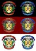
Looks great thank you, Sam. It's exactly how I envisioned it to be. Fan-Bloody-Tactic!!!!!!
I like the font you have used as well because it fills the space and looks appropriate.
By the time this is coloured in it will look a million dollars. The thing I really like about it is that it will look just as good in a 100 years from now as it's a timeless design")
As soon as it's done I will start drawing up all the 2017 flyers, brochures and advertising/marketing material with the new Masters crest...........Plus send it off to Bill for the web site etc etc.
It will be officially launched in the next FEGA Engraver magazine.................I'll have to think about this but maybe even have it on the cover. Now that would be a first
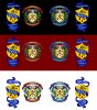
I like the font you have used as well because it fills the space and looks appropriate.
By the time this is coloured in it will look a million dollars. The thing I really like about it is that it will look just as good in a 100 years from now as it's a timeless design
As soon as it's done I will start drawing up all the 2017 flyers, brochures and advertising/marketing material with the new Masters crest...........Plus send it off to Bill for the web site etc etc.
It will be officially launched in the next FEGA Engraver magazine.................I'll have to think about this but maybe even have it on the cover. Now that would be a first