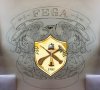
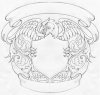
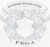
Here's what I have so far. I've only drawn one half, but have mirrored it in Photoshop so you can see how it looks with both sides put together. I'm teaching this week so I've been squeezing this in between lessons
Dan can do a better job at the lettering and I just stuck the date there for grins.
YES!!!!...........We are on the right path and with a bit of refinement will do the trick nicely.
I've made some alterations.
1. Claws on side help disguise those big blank triangle areas created by the crossed hammer and chisel
2. Eagles head to give it a meaner graphic look
3. Altered the shield so it remains the same as the FEGA logo shield (requires a better balance than I have done which is rough as guts)
4. FEGA Master Engraver fonts.......................yes, Dan can hand letter. But we also need a digital one.
I suggest we use www.letterheadfonts.com and use something like "Antique Shop" type font. It costs $59 but FEGA will pay for it. (Or you may have another font in mind. It has to be legible and not over the top fancy for digital reproduction.
Ok, I can make the eagle meaner looking and add the claws. I think that Antique Shop font might be too ornamental. Seems to me a Roman style is better suited? I have several from Letterhead fonts. I'll have a look and experiment with them.
So it will say FEGA in the top banner and MASTER ENGRAVER in the bottom, correct?
I ordered a Wacom Cintiq tablet for digitizing this. My old Cintiq wasn't compatible with this mac. I'm anxious to have one again. I hope I like the smaller size 13" model.
Yes, a stylised mean eagle head would look good.........it's funny but all of our zoomorphic, grotesques and animals always look grumpy or mean
Yes, FEGA at top and Master Engraver on the bottom.............trying to fit "Firearms Engravers Guild Of America" would be a mission and so small no one could read it. You could try tinkering with it and see if it works if you want.
Yes, you're right. A Roman style would probably better and more easily read.
By the time this is refined, digitised, coloured in etc etc.............it'll look HOT!!!!!
I'm still using a Wacom Intuos 3 tablet. Mind you, I use it bugger all. Just for outlining and transferring drawings.......Mine is the big one (A4 size) and to be honest, when I replace it I'll go for the smaller one as the big one is a bit awkward
I love the Cintiq series. My previous one was a 21" and I really perfected scroll drawing with it, and used it for 99% of my iStock portfolio. This one will be a bit different though. I tested one briefly that a student had and liked it.
I was holding off on the eagle's feet until I got the exact placement of the tools in the shield.
Are you ok with the scroll above the eagle's head but without the numbers in it?
Yes, it's a balancing act with all the tools etc. All I can say is thank goodness for computers and the ability to move things and resize instead of constant redrawing with pencil and paper
I'm not that keen on the top ribbon even without the numbers. It'll just be a big blank space...............maybe a bit of acanthus instead???
Or........If the eagle head was tilted and feathers going into that space it would look better...............or it could look like a cockatoo!!!!
I hope you don't mind me saying all this.........I don't want to frustrate the hell out of you and I know you are tied up at the moment.
Looking at the wing feathers I see a running wheat type border thing happening. Maybe instead of shading them like realistic feathers which is incredibly hard to do and to get right..........shade them like a wheat border????????
I'll try that. It's a neat idea everyone can identify with. I'm hoping for an engraved look for sure and have been studying banknote engraved eagles. We'll see how the wacom does for that. I'll get back on it tomorrow!