I like the hat..........I think what would make it look more "authentic" would be lines to give it shape. In other words, shade it like we were engraving it. It would give it that engraved heraldry look of you get my drift.
The shield..I prefer the top one that has a more 3D embossed look.
1981 still needs to be more subtle
Mind you, once you have all the elements in place it can be fine tuned. Definitely on the right path and looking good
I find the hat rather confusing.
The coat of arms is pleasant in it's general appearance and has a nice balance but to me, lacks a clear definition of what the tools are. Please understand that my input is purely as a non engraver and someone who had to google the definition of "burin". I think the tools need to be more defined. The chisel looks like a pen perhaps because of the side view. The hammer has lots of detail in the metal part, and the handle has a strange spoon shape, almost non-hamerish. What is the round thing at the bottom that looks like a cannon? Would a simple chisel and hammer be a clearer representation of engraving? Perhaps the letters FEGA could be incorporated into this. I was expecting something more hand crafted, What would this look like if you were to engrave it?
I'm not crazy about the hat myself design-wise, but it has historical importance for the Guild, since a founding member from TX used his hat to take up a collection to get the guild started, so it's sort of an icon. I do think it makes the coat of arms less regal though.
The chisel is patterned off the one on the original guild logo. There's no standard chisel handle shape. Many are steel handles which are quite thin and some are considerably shorter in length. This one seems to balance out size-wise with the chasing hammer.
The hammer is patterned from an antique one I have here. Some have different shaped swells in the handle but most of the heads look like this one.
The canon is an engraver's ball vise.
I will work on line shading as opposed to colored fills.
The gold background might look best in 24K gold. let the light reflect some brilliance. Also, it would be somewhat cumbersome to achieve the gradient look behind the tools in a small 1" space (or so) with watercolor. For a website what you have done is perfect.
I like Dan's idea about the 24k gold for certificates.
I also like the gradient fills for signage, web sites etc etc.
Also, the gradient fill will look good when it comes to acanthus leaves, ribbons, etc outside the shield
So it will probably be that we end up with 2 or 3 versions. Full colour gradient, back,white and greyscale......and an outline for customisation like what Dan is doing or hand engraving .
I think we should stick to the shield shape..........this gives us continuity between the FEGA logo and the Masters coat of arms. If they are approximately the same area/mass then it's easier to balance them out when doing print ads and signage
The problem with a graphic like that, as beautiful as it is, it becomes unwieldily in certain printing applications like business cards, flyers etc etc as you have to make the graphic so small it becomes illegible
I think we should also stick to standard heraldry with a modern Sam Alfano flair. Nothing wrong with a bit of scroll intertwined with acanthus leaves as it's what we are about.
The top ribbon area is also going to have to be long and drooping down as it has to fit the wording "Firearms Engravers Guild Of America" which is quite a mouthful.
Cowboy hat, crown and vise as the helm. It's hard to say isn't it without seeing all the other elements of the design together
I'll draw up a thumbnail with pencil and paper and post it to give you an idea of where my head is at.
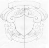
Here's an idea. It's as rough as guts and only a thumbnail.
A bald eagle head (iconic American symbol) with spreading wings that morph into scroll and acanthus. Obviously the eagle head has to be more stylised and meaner looking etc etc. It could also have claws holding the shield up on the top or edges which will help fill the shield blank areas
Top ribbon has FEGA. Bottom ribbon has Master Engraver
The overall shape is roughly square which makes it easy to work in all other media.
I like it very much! I plan to work on individual elements of the certificate separately. Once the individual pieces are final and agreed upon, I can start the layout. This will help to reduce do-overs and make the process evolve smoothly.
Knights acanthus is perfect for this type of work. It's timeless, old school and looks so lush, rich and regal...........you can see where the Ken Hunt school of acanthus evolved from that old Victorian era.
The thing about the bald eagle claws holding the side of the shield will help diffuse those big blank triangular spaces created by the crossed hammer and chisel.
The eagle feathers can also overlap the shield which again, helps diffuse those triangular spaces.
The eagle doesn't have to be life like.........stylised and mean generally works


")