my second bracelet design

John B.

Lifetime Pledge Member
::::Pledge Member::::
Joined
Nov 9, 2006
Messages
3,956
Location
Los Angeles area, California.
Arnaud,
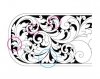
Well done. You are on the right track.
Only thing I see wrong with your latest drawing is that the red line should intersect the green line a little lower down to avoid the flat spot on the end of the design.
Yes, this will leave a little more open space on the outside of the scrolls at the end of the design but that can be filled with some tendril and leaf work on the outside of the backbone.

Best regards.
 
Last edited:

Mike Fennell

Elite Cafe Member
Joined
Apr 6, 2007
Messages
660
Location
Matteson, a south suburb of Chicago.
Arnaud, I have been working on a similar design and enjoyed watching the progress of your project. I will post my solutions much later, when I get my studio back. Thanks for the thread and all who contributed. It has been helpful.

Mike Fennell
 

Arnaud Van Tilburgh

~ Elite 1000 Member ~
Joined
Oct 3, 2008
Messages
4,221
Location
Belgium
John, I made some minor changes and gave the starting scrolls some more open space. I understand these areas are quite easy to fill with tendrils and leaves.
Making them touch each other properly was quite difficult without changing the whole design.

I hope this looks quite good, at it looks good to me.

arnaud


John B.

Lifetime Pledge Member
::::Pledge Member::::
Joined
Nov 9, 2006
Messages
3,956
Location
Los Angeles area, California.
Arnaud,
That looks good to my eye and you have cured the flat ends very well.
The outside work at the ends will blend and balance well with some of the outside work required in other areas of the design.
Look forward to seeing your leaf and negative space layout.
Best.
 

Arnaud Van Tilburgh

~ Elite 1000 Member ~
Joined
Oct 3, 2008
Messages
4,221
Location
Belgium
Thank you John for your help on this design. Again I have learned a lot from it. When adding the leaves and tendrils, this will show if I’m on the right track.
One of the important things is probably showing the connections of the different stems, this was something that was not respected on my first try.
I suppose that even a very small start has to be shown, so the eye can understand the flow? When hiding these, the design will look more chaos.
Can’t remember ever read about that, but it is quite logic.

To be continued,

arnaud
 

John B.

Lifetime Pledge Member
::::Pledge Member::::
Joined
Nov 9, 2006
Messages
3,956
Location
Los Angeles area, California.
Thank you, Arnaud.
The actual point of connection does not have to be shown for ALL scrolls.
Some can originate from under a leaf.
But the angle and flow of the backbone as it flows under the leaf should be correct for its point of origin.
Many of the excellent scrolls that showed the minimal amount of background that Sam posted and you admired did not show the actual connection to the previous scroll.
But they all showed the proper angle and flow where they emerged from under a leaf or crossed a backbone.
Best of luck with the rest of your design, I look forward to seeing it.
 

Arnaud Van Tilburgh

~ Elite 1000 Member ~
Joined
Oct 3, 2008
Messages
4,221
Location
Belgium
I have been busy quite intensive, and in between worked on this design.
But in a way I have he feeling I’m overdoing this. So before continuing I would like to hear from you, especially from John B. as he helped me with the backbone already.
I can engrave very tiny scrolls, but of course not everyone has a scope in his pocket.

arnaud


KCSteve

~ Elite 1000 Member ~
Joined
Jun 19, 2007
Messages
2,882
Location
Kansas City, MO
Arnaud

One thing Roland Baptise does with his designs is to print them out life-size and then stick them down on the object to be engraved. For this one you'd just need the printout, of course.

Use a bit of tape or a rubber band to hold it in place around your wrist and see if it looks good in real life.

Sure looks great here!
 

Mario Sarto

Elite Cafe Member
Joined
Jul 30, 2008
Messages
611
Location
Bad Salzuflen
Hello Arnaud, of course i am not John B., but if you don't mind, i would like to add two thoughts on this.
The overall designs is great - i like it. What i have marked with red circles, what if you do the shape of these leafs much simpler? They are very small-sized and i believe in this case less is more. The blue marked is to my eyes a little bit to laminar.
Regards, Mario.
 

Attachments

  • arnauds-bacelet-design.jpg
    arnauds-bacelet-design.jpg
    26.2 KB · Views: 134

Arnaud Van Tilburgh

~ Elite 1000 Member ~
Joined
Oct 3, 2008
Messages
4,221
Location
Belgium
Yes Mario, I’m aware of those, indeed I have to simple those down, thank you’re your feedback.
Want to be sure I’m on the right track, and as it felt a bit overdone to me, probably it are those too complicated small leaves that were telling me that. :big grin:

arnaud
 

John B.

Lifetime Pledge Member
::::Pledge Member::::
Joined
Nov 9, 2006
Messages
3,956
Location
Los Angeles area, California.
Arnaud,
Thank you for the complement and kind words.
A small problem that jumps out at me is at the point of origin where the small scroll, scroll #2 at the top left originates from the larger scroll.
Even with shading it will look as if the stem thickness of the backbone is withered at this point and does not have enough body to carry the “feedingâ€￾ life to the leaves and scroll.
There is a very easy fix. Just make it appear as if the inside line of the first leaf comes out from under the leaf above it. Because the area is blackened in on your drawing I can’t show it clearly but have included an attachment and green arrow pointing to the area.
Best.
 

Attachments

  • Arnaud's Bracelet 001.jpg
    Arnaud's Bracelet 001.jpg
    25.9 KB · Views: 201

John B.

Lifetime Pledge Member
::::Pledge Member::::
Joined
Nov 9, 2006
Messages
3,956
Location
Los Angeles area, California.
Mario,
You have a very good point. Some less complex leaves will look great when shaded, especially at the scale of this piece.
And both you and Arnaud are doing some first class, interesting shading.
Best regards.
 

Arnaud Van Tilburgh

~ Elite 1000 Member ~
Joined
Oct 3, 2008
Messages
4,221
Location
Belgium
Thank you John, it is clear to me what you and Mario pointed on. Indeed the thickness of a stem, coming out of an other one, is sometimes too thin. I should concentrate on that more.

I will fix the problems and work it out trying not to make the same mistakes again.

It is the complexity of some leaves that made me doubt that I was overdoing this. I could have done it with less complex leaves, but then I would not have explored new ways. And that is quite important to me to make progress.
Making mistakes is a good way to learn.

arnaud
 
Last edited:

John B.

Lifetime Pledge Member
::::Pledge Member::::
Joined
Nov 9, 2006
Messages
3,956
Location
Los Angeles area, California.
You are right, Arnaud.
Sometimes one has to push things to explore new experiences.
Even though I know better, I often make the same mistake and make the stem too thin. Looking forward to seeing your bracelet completed when you find the time.
Best.
 

Arnaud Van Tilburgh

~ Elite 1000 Member ~
Joined
Oct 3, 2008
Messages
4,221
Location
Belgium
Finished this second one

Finished this second one.

Of course, the backbone was the main important drawing, as if not right, even adding leaves would not have make it better.
It was Sam Alfano’s design, which inspired me to design something in similar style, with less background.
Once again I will engrave it on Titanium. And I’m aware, the more lines the more time it will take to cut. One advantage is that there is much less background to remove, on the other hand there also will be more shading.
I probably won’t have to tell you I used my “plastic penâ€￾ to draw this. One advantage drawing this detailed scrolls with that pencil, is being able to zoom in and out. As I had to be aware of the real size I will cut it.

It was quite a lot of work too to design all the leaves, but I’m pleased with the result. And sure I could spend even more time on this design, but I’m convinced that whatever design, one can always improve it.
Having it drawn with vectors however, will make it possible to draw minor or significant changes.

arnaud


and some details


Arnaud Van Tilburgh

~ Elite 1000 Member ~
Joined
Oct 3, 2008
Messages
4,221
Location
Belgium
Thank you for you kindness and support on this design John, I will show the bracelet once finished. But also that will need time to cut properly.
I also will have the shade it precisely, not overdoing it on the smaller details.

arnaud
 

Arnaud Van Tilburgh

~ Elite 1000 Member ~
Joined
Oct 3, 2008
Messages
4,221
Location
Belgium
almost done

Well this one isn’t finished yet, but probably within two days or something like that.
I searched for my starting tread on this design to be able to close it once finished
So this is still to be continued.
.

I show some steps in between after cutting the mainlines, removed all that tiny small areas, stippled using my sandblasting devise, coloured the whole Ti sheet like brass, then used sandpaper to remove the oxidising on the upper level and started shading.

arnaud


Arnaud Van Tilburgh

~ Elite 1000 Member ~
Joined
Oct 3, 2008
Messages
4,221
Location
Belgium
Mc, yes I'm pleased with the background as well. But I think I will have to do some shadings over again, need more blacks although live I see them.

It will be hard for me to start another can of worm (Ron Smith) again. I started it before reading Lee's book chapter on budget. :)
I need some recent engraving job to illustrate my skills of today.

arnaud

arnaud
 

Sponsors

Top