
Andrew Biggs
Moderator
The use of borders to contain and frame your designs is an essential element to the process of design. It should be the very first step that you do before anything else. These borders act as guidelines and actually make the design process easier, not harder.
It should be noted that the borders do not always have to be cut but should always be drawn.
It’s important to remember that the white space, sometimes referred to as the negative space, is an essential and integral part of the design. It is not separate. This includes the borders, backgrounds and any areas that are not cut. Everything must be balanced to give a harmonious appearance that is pleasing to the eye. This isn’t unique to engraving and it applies across the board to all aspects of design. Borders are extremely useful for pulling together different elements that make up a whole like a gun.
As usual, there are exceptions to this but it is a good rule of thumb to adhere to as a beginner. As your knowledge, skill and understanding grows then you can start bending the rules and pushing the boundaries of design.
Below are a few examples of what I’m talking about.
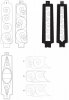
A. A floor plate that was recently posted on the forum. As you can see it has no borders, therefore no guidelines to help with the design process. The scrolls are unevenly placed on the plate and the distance to the edge of the plate are different for every scroll. This gives an unbalanced and random look that is not pleasing to the eye. It is a haphazard approach to the work.
B. The same floor plate but with a border. The scrolls come out to the border and any subsequent leaf work ill also touch the borders. This gives the whole design an integrated and pleasing look to the eye. This actually makes the design process easier as it gives you set boundaries for the work.
C & D. This gives you an idea of white space. Also referred to as negative space. It isn’t always desirable to fill up the whole area with a design. Lots of white space around a design is often seen as elegant or classy. Example C is just a rectangle drawn on the plate and filled with even sized scroll. The black area is the white space around it. The rectangle doesn’t fit the space well and jars the senses. It just looks like it’s been banged in there without a lot of thought. In other words it looks wrong and when you fill the scroll with leaf on the inside and outside this will be even more noticeable.
Example D has the border following the contours of the floor plate evenly so it is wider at the bottom and narrower at the top. The scroll is larger at the bottom and tapers down as it gets to the top. This gives the design a far more harmonious integration with the actual plate. The leaf work will further dramatise the effect. The design and white/negative space work together to give balance to the whole design………………The difference between C and D is subtle bit it is there and people will notice it straight away on the finished work. It is the difference between a professional job and an amateur one.
E. This demonstrates the use of shapes within the working area of the plate. I have simply drawn borders to place the scroll in. The oval could have a monogram or a scene in it. The triangles have simple scroll. You could go further to create more triangles on the four corners and fill them with scroll as well. This would create a pattern with defined borders. Because the design is symmetrical and the White space triangles are even, the design will work. Balance is the key to all design.
F. A knife bolster without a border line, therefore no guidelines. It’s pretty much the same as example A, just a different shape. You see this a lot with beginners. The spacing of the outside edge of the scrolls to the edge of the bolster is all uneven and random. Any leaf work will just emphasise the randomness of the design and never look any good no matter how hard you try. It will always look a bit “off” and out of balance.
G. The same shape and design with a border. The scrolls have been adjusted to fit the borders. When filled with leaves it will have a pleasing look to it. You can cut the border line if you wanted to.
H. The exact same design as G but with the borderline not cut, but it is still there when the eye looks at it.
These are just a few really basic examples and people have written libraries on this kind of thing.
As I said earlier, there are exceptions to all this but as a beginner just starting out, you would be wise to always draw your borders first and work within those borders. It will help you with the design process more than you think. As you start getting the basics into your head you will be able to stretch your skills beyond these basic concepts. But if you ignore them totally you will just hinder your progress. What you are striving for is balance and harmony within the given shape you are engraving. Borders/guidelines can help you achieve that.
Cheers
Andrew
It should be noted that the borders do not always have to be cut but should always be drawn.
It’s important to remember that the white space, sometimes referred to as the negative space, is an essential and integral part of the design. It is not separate. This includes the borders, backgrounds and any areas that are not cut. Everything must be balanced to give a harmonious appearance that is pleasing to the eye. This isn’t unique to engraving and it applies across the board to all aspects of design. Borders are extremely useful for pulling together different elements that make up a whole like a gun.
As usual, there are exceptions to this but it is a good rule of thumb to adhere to as a beginner. As your knowledge, skill and understanding grows then you can start bending the rules and pushing the boundaries of design.
Below are a few examples of what I’m talking about.
A. A floor plate that was recently posted on the forum. As you can see it has no borders, therefore no guidelines to help with the design process. The scrolls are unevenly placed on the plate and the distance to the edge of the plate are different for every scroll. This gives an unbalanced and random look that is not pleasing to the eye. It is a haphazard approach to the work.
B. The same floor plate but with a border. The scrolls come out to the border and any subsequent leaf work ill also touch the borders. This gives the whole design an integrated and pleasing look to the eye. This actually makes the design process easier as it gives you set boundaries for the work.
C & D. This gives you an idea of white space. Also referred to as negative space. It isn’t always desirable to fill up the whole area with a design. Lots of white space around a design is often seen as elegant or classy. Example C is just a rectangle drawn on the plate and filled with even sized scroll. The black area is the white space around it. The rectangle doesn’t fit the space well and jars the senses. It just looks like it’s been banged in there without a lot of thought. In other words it looks wrong and when you fill the scroll with leaf on the inside and outside this will be even more noticeable.
Example D has the border following the contours of the floor plate evenly so it is wider at the bottom and narrower at the top. The scroll is larger at the bottom and tapers down as it gets to the top. This gives the design a far more harmonious integration with the actual plate. The leaf work will further dramatise the effect. The design and white/negative space work together to give balance to the whole design………………The difference between C and D is subtle bit it is there and people will notice it straight away on the finished work. It is the difference between a professional job and an amateur one.
E. This demonstrates the use of shapes within the working area of the plate. I have simply drawn borders to place the scroll in. The oval could have a monogram or a scene in it. The triangles have simple scroll. You could go further to create more triangles on the four corners and fill them with scroll as well. This would create a pattern with defined borders. Because the design is symmetrical and the White space triangles are even, the design will work. Balance is the key to all design.
F. A knife bolster without a border line, therefore no guidelines. It’s pretty much the same as example A, just a different shape. You see this a lot with beginners. The spacing of the outside edge of the scrolls to the edge of the bolster is all uneven and random. Any leaf work will just emphasise the randomness of the design and never look any good no matter how hard you try. It will always look a bit “off” and out of balance.
G. The same shape and design with a border. The scrolls have been adjusted to fit the borders. When filled with leaves it will have a pleasing look to it. You can cut the border line if you wanted to.
H. The exact same design as G but with the borderline not cut, but it is still there when the eye looks at it.
These are just a few really basic examples and people have written libraries on this kind of thing.
As I said earlier, there are exceptions to all this but as a beginner just starting out, you would be wise to always draw your borders first and work within those borders. It will help you with the design process more than you think. As you start getting the basics into your head you will be able to stretch your skills beyond these basic concepts. But if you ignore them totally you will just hinder your progress. What you are striving for is balance and harmony within the given shape you are engraving. Borders/guidelines can help you achieve that.
Cheers
Andrew
Attachments
-
 Borders.jpg61.2 KB · Views: 414
Last edited:
 :clapping:
")


