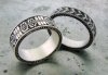
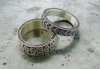
I guess I'd start with the black background. It's not nearly deep enough as I can see high spots in various places. I don't care much for the design on the left ring, especially with the row of millgrain running over the elements. The three bars might have some significance, but artistically the design is pretty weak. You obviously have potential and I think with a better design you'd really shine.
You obviously put a lot of work in here, so I'm reluctant to be negative, but I concur with Sam, the design could be livened up. On a brighter note, you obviously can engrave quite small elements pretty well. Keep on keepin' on and you won't be able not to improve.
Thanks for the comments. I meant to comment sooner but life is busy. Despite the economy the store I work at (William Travis Jewelry) is still very busy. I make more contemporary jewelry so I was trying to incorporate that into my engraving. Sam, I am coming to GRS for your combo class with Diane and I am very excited to learn more.