Practice Plate GRS Pattern 190

Arnaud Van Tilburgh

~ Elite 1000 Member ~
Joined
Oct 3, 2008
Messages
4,221
Location
Belgium
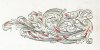
This one I did for the main lines with a 115°, face 45° and a parallel heel of 15°. For the shading lines I used a 60°, 50° face and a parallel heel of 10°.

The 60° is not OK. So I will try a 90°.

Before I only used a 120° for both main lines and shading.
With some help I came to the idea that a smaller angle is easier to control.
It is like driving a car where the gas pedal has only 1cm instead of 10 between slow en top speed.
Also a burin with a angle of 90° has to cut deeper to make a line the same wide as a 120°.
A deeper line makes the engraving less fragile.

Anyway, this is my most recent attempt to cut nice.
The shading I would have done different on some part, but there was the laser design.

Question: should it be better to double the shading lines or is it enough?
All comments to increase my cutting are welcome

arnaud


Sam

Chief Administrator & Benevolent Dictator
Staff member
Joined
Nov 6, 2006
Messages
10,491
Location
Covington, Louisiana
Arnaud, that is a very respectable piece of engraving. You are making great progress!
 

Andrew Biggs

Moderator
Joined
Nov 10, 2006
Messages
5,034
Location
Christchurch, New Zealand
Hi Arnaud

I've taken the liberty of taking your photo and making some suggestions.

But first a disclaimer.............these are my opinions only and others may, and will, think differently so it's only something else to add to the mix.

The trouble with enlarged photos is they wash out some of the intensity of the engraving. So like everything it has to be a judgement call on your behalf how far you want to take it and the effect that you are trying to achieve, Also the optical difference between the photo and the real thing. :)

The areas I've marked in red may need a little extra work in shading. You will notice it’s mainly in the areas of crossovers where one thing cross' over another. By adding that extra shading/cross hatching adds intensity and darker shadows which can enhance the 3 dimensionality of the engraving. So in effect one advances to the foreground and the other recedes into the background. This can be intensified with more shading lines or cross hatching.

Cross hatching can also add form and shape to the leaf (see the far right hand leaf) In other words, curves the leaf

Cheers
Andrew
 

Attachments

  • Arnaud.jpg
    Arnaud.jpg
    54.4 KB · Views: 186

Arnaud Van Tilburgh

~ Elite 1000 Member ~
Joined
Oct 3, 2008
Messages
4,221
Location
Belgium
Andrew, thank you for taking the time to examine my practice plate.
I understand what you mean about shading and 3D effect that appears when darken the areas you point to in red.
The goal in my opinion is to use a tonal wide (white to black) that makes the most 3D effect.
I will give it a try as I think it still can be done, only to black can't be whitened? :D

Are there some rules for cross hatching? I know they are right-angled to the surface where they are on.
Is cross hatching done to accentuate the form of a leaf or just a way to shadow leafs?

arnaud
 

Arnaud Van Tilburgh

~ Elite 1000 Member ~
Joined
Oct 3, 2008
Messages
4,221
Location
Belgium
Andrew, I have done some extra lines as you advised and I found some other similar shadings that could be better.
I have been making two new burins, the 115° I'm still busy on, the 90° with parallel heel for shading I used to correct some shading lines.
I know it is not perfect yet, some parts can also use some darking. But up to the next plate.

I'm almost absolutely sure the 90° is my best tool for shading. :D
It can cut almost invisible lines, I can easily control the wide of the shading lines and the point didn't break yet. :D

So I will try this pattern once again, but the shading I will do it on my own, with all the information I gathered in this Café of course.

So thanks again to all for your support

PS. I aslo have put the 1.8 nikon lens on my camera, There is no macro on it but the photo's seems to be much better

arnaud

 
Last edited:

soj

Member
Joined
Jun 8, 2008
Messages
82
Location
Lubbock, Texas
Arnaud, that is a great plate. I want to thank you for showing your pictures and asking and getting all the great tips. I am learning a lot from your posts. Thanks
 

Andrew Biggs

Moderator
Joined
Nov 10, 2006
Messages
5,034
Location
Christchurch, New Zealand
Hi Arnaud

Yes, to my mind it makes a difference what you have done. The changes are subtle but make a difference and now the engraving doesn’t look so flat. On the actual plate you must notice a difference as well. (Large photos tend to wash out the intensity sometimes) An old trick with larger work is to squint your eyes and that brings back the intensity.

With very complex designs where you have a lot of crossovers with scrolls and leaves interconnecting and weaving in and out from one another then you need more intense shading to clearly define shapes, light and shadow otherwise it can look more like a jungle of confusion. Simpler designs without all of that can be shaded a little less intense to portray dimension.

You can see on that far right hand leaf that by cross hatching you have curved the leaf and given it some extra shape. That way you can make a leaf either convex or concave depending on which way you curve the cross hatch. Or the leaf can be made to look flat by keeping the lines straight. Try it with a pencil and paper on a couple of leaves and you’ll see what I mean.

Lines very close together look dark, almost like a solid mass. Lines further apart look lighter. Therefore, if you start placing your lines close and gradually move them further apart they will look like they are going from dark to light. This is true of vertical lines (main shade lines) to horizontal lines (cross hatching)

Shading lines that start further apart then converge to a small point look like they are going from light to dark (or dark to light) You can also make your lines appear darker by going deeper which then makes them wider. Cross hatching should always be lighter than the shading cuts.

So it is up to you as the engraver to make the judgment call how far you want to take this on a piece and the effect you want to achieve. The more lines equals the more time you spend on it.

Other peoples work is always seems perfect, but never your own. I think that’s a universal law about everything. It certainly applies to me!!! :)

My favourite shading gravers are 70 and 90 depending on the size of what I’m working on. But that varies from engraver to engraver. It’s just a matter of your own personal preference.

Just keep at it………..you’re doing great!!!

Cheers
Andrew
 
Last edited:

Arnaud Van Tilburgh

~ Elite 1000 Member ~
Joined
Oct 3, 2008
Messages
4,221
Location
Belgium
Andrew, thank you for taking the time to answer my question. It is totally clear to me.
The trick "looking true your eyelashes", I knew it from photography, it shows the "tonal range" more clear.
Some shading that could have been better that I see in this practice plate is that keeping the shading parallel to the shape of the leafs is most important.
Whether they follow the shape of the leaf or stops at some space from the main line edge.

Like in this illustration

arnaud
 

Attachments

  • shadingpar.jpg
    shadingpar.jpg
    32.3 KB · Views: 82

Kevin P.

~ Elite 1000 Member ~
Joined
Feb 28, 2008
Messages
1,256
Location
Nambe, NM
Your plates along with Andrew's critique is very helpful to many of us. You're very adventurous with your shading. Keep it up. I'm learning along with you.
I've been doing Lynton McK's plates and I'm coming to an understanding, at least I think so, of why he did what he did. And every mistake is a jump ahead.
Kevin P.
 

Kevin P.

~ Elite 1000 Member ~
Joined
Feb 28, 2008
Messages
1,256
Location
Nambe, NM
Andrew, I'm reading your comments with rapt attention and learning much about principles of shading. Thanks.
Kevin P.
 

Andrew Biggs

Moderator
Joined
Nov 10, 2006
Messages
5,034
Location
Christchurch, New Zealand
Hi Kevin

Glad to be of help. But just keep in mind that what I’m saying is only my way of looking at things. Others will see it differently…………and so they should.

Principles are only that………principles. Once you get your head around them then you can do anything with them or even completely discard them if you wish. It all comes back to you as the engraver and what it is that you wish to achieve and the style(s) you are developing or wish to emulate. It would be a poor world if all of our engraving looked the same.

The one thing that theory can never replace is bench time. Both cutting and drawing. Do both as much as you can and as often as you can and then some. They are really the only two things that will improve your understanding and skill base. The more time you send at the bench and with pencil and paper the quicker the progress will be. As you have rightly observed mistakes are an integral part of the process and learning curve.

Learning the basics is also essential. You can’t expect to look at the most complicated and sophisticated of designs and hope to leap in at that level. Go back to a single scroll and learn to draw it properly………then add another and another until you develop an understanding of how they work and integrate with one another. With this basic understanding your designs will start becoming more sophisticated in a natural manner.

Copy a leaf and shading lines and start drawing them one at a time until it becomes locked into your memory. After a while you will start developing and expanding on those ideas.

The other thing I would highly recommend is that you buy a few decent inspirational books like “British Gun Engraving†by Douglas Tate. Yes, you can download pictures from the internet etc which is all good………. but you can’t read them in bed, on a plane, train, watching TV or anything else. Just by sheer osmosis you’ll start picking a lot of this up.

It is important to start developing and nurturing a critical eye for good engraving and the difference between good and not so good. The only way to do that is by constantly looking at good engraving. By developing this critical eye you will gain more awareness in your own work and the flaws in it…………..self critique is essential and the one rule in all this is…………if it doesn’t look right…………then it isn’t. So keep going till it does……..and even then you could be wrong!!! :)

Well that’s my ramblings for the day.

Cheers
Andrew
 
Top