
LVCIAN
Member
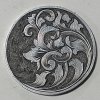
My father, an avid golfer, wanted a ball marker.
Here's is what I've come up with. It's about the size of a half dollar, I'm still pretty new to engraving so I'd love to hear your thoughts.
Here's is what I've come up with. It's about the size of a half dollar, I'm still pretty new to engraving so I'd love to hear your thoughts.
Attachments
-
 IMG_20170627_204631_154.jpg180 KB · Views: 287
Last edited:
") They are in the other side. I had thought about hiding my initials there on the left.
They are in the other side. I had thought about hiding my initials there on the left.


