
You are using an out of date browser. It may not display this or other websites correctly.
You should upgrade or use an alternative browser.
You should upgrade or use an alternative browser.
New Engraving
- Thread starter Sandy
- Start date
cowboy_silversmith
Elite Cafe Member
Sandy~ Looks pretty clean! Nicely done!
Best regards,
Greg Pauline
Best regards,
Greg Pauline
Andrew Biggs
Moderator
Hey Sandy
That looks great!!!
So is that vise you won at Reno getting a good workout?????
Cheers
Andrew
That looks great!!!
So is that vise you won at Reno getting a good workout?????
Cheers
Andrew
nicglass1
Member
looks good to me!
Christopher Malouf
~ Elite 1000 Member ~
I agree. Nice clean cuts and smooth curves.
You're ready to go one step further..... I love Old English lettering - it's got style which you want to maximize ... for the next step, cut equidistant, horizontal lines in the interior of the letter after you've got the outline done. Then use a flat to bright cut one side to give it a three dimensional look. You can even cut the top or bottom in addition to one of the sides. It adds another angle of perspective .... as if you were seeing the letter from the top left or bottom right.
You'll have to try this on a new set of letters because you can't do it after stippling. A 37 or 38 flat will do just fine until you get hang of cutting with the edge of a flat. From there you can go to a 40 or larger to get an even wider cut.
Here's a block letter which can better illustrate what I'm trying to describe. It can add up to a great deal more time invested per letter but it sure looks great ... especially when your doing heirloom type stuff.
Regards,
Chris
Last edited:
i too like the oe. that's a very nice added dimension with the xtra bright cut. definately adds to the lettering !
Winstonklein
Elite Cafe Member
looks awesome!!!!!!!!!!!!!
KCSteve
~ Elite 1000 Member ~
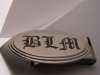
Nice looking money clip Sandy!
Chris
Interesting! So what you're doing is a different background technique inside the letter (the horizontal lines) and then using the bright cuts along one 'side' to give the illusion that the letter is raised up off of the background rather than cut into it, right? I like the look of that and will have to give it a try.
Good going, Sandy.
Way to go!
John B.
Way to go!
John B.
Neat as a pin, Sandy. Well done!
Thanks guys.
Chris-- I'll give that a try. My bright cutting needs a lot of work.
John, Just had another bought. Everything is fine again.
Andrew, Shipped it to Joe Rundell. He has a finer touch.
Mr. Ron, I am still attempting. Good Lord willing I'll get there.
Again Thanks Guys.
Sandy
Chris-- I'll give that a try. My bright cutting needs a lot of work.
John, Just had another bought. Everything is fine again.
Andrew, Shipped it to Joe Rundell. He has a finer touch.
Mr. Ron, I am still attempting. Good Lord willing I'll get there.
Again Thanks Guys.
Sandy
Christopher Malouf
~ Elite 1000 Member ~
That's ok Sandy ... start with a 37 or 38 because it's much easier to control. You just want to bevel one side of the letter a little. Even rolling a square over a little will work. With the way you handled the smooth and precise curves on this Old English, it'll be easy!! Just in case yer wonderin' about getting those horizontal lines even. Just use the width of the graver to guide your cut against your previous line. That's good practice for cutting parallel lines without a scribe or measuring.
Steve, you got it. Diagonal lines work nice too. When you got a bunch of letters and words going across something, you can add perspective to the entire word as well. Say you are looking down at a 5 letter word head on. Bright the tops of all the letters and then do the left side of the last two letters and the right side of the first two letters. Looks great on a gun. Heck ... I think it just looks good.
Hope that helps out. Lettering isn't easy so I just thought I would share a cool trick.
Chris
Andrew Biggs
Moderator
Andrew, Shipped it to Joe Rundell. He has a finer touch.
WHAT!!!!............You should have sent it via New Zealand.!!!!

Cheers
Andrew
KCSteve
~ Elite 1000 Member ~
Chris,
I like the tip about using the graver (already in your hand) to space the lines. I assume that if you want them finer you just do the first pair, then split the difference by eye (which tends to be pretty precise on things like that) and then do lines 4 - n by using the graver to 'reach back' past the line you just did to get the spacing for the next one.
Do you have a picture of lettering with the right / left shading? I'm thinking it should look like it's curved / arched, possibly even looking like it's rising up off of the surface but until I get a chance to try it / see it I can't be sure I'm picturing it right.
Cross-shading spacing gets easier as you develope a rythum with experience and it goes rather fast. The tricky part is to not get any run-overs.
..........A good way to give depth and importance to any letter or heading, particularly on large letters or monograms that have mass.
..........A good way to give depth and importance to any letter or heading, particularly on large letters or monograms that have mass.
Sponsors


