
You are using an out of date browser. It may not display this or other websites correctly.
You should upgrade or use an alternative browser.
You should upgrade or use an alternative browser.
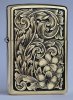
My latest Zippo
- Thread starter vilts
- Start date
Willem Parel
~ Elite 1000 Member ~
Incredible engraving, nice scrollwork and shading.
I hereby proclaim you KING OF THE ZIPPO. :bow:
What beautifully designed and executed work! :clapping:
What beautifully designed and executed work! :clapping:
Arnaud Van Tilburgh
~ Elite 1000 Member ~
That sure is nice, great looking Zippo Viljo 
Just one thing that bothers me on the shading, the ends of the scrolls, sure it is nicely done but you make them look so "massif" compared to the leaves.
I try to make mine look more massif but not that massif. So I can see now how you do that by making the inner scroll flat and the back thick and rounded.
arnaud
Last edited:
Thanks for the good words! Sam, a lot of this result is thanks to you - starting from the basic course and following up with the design DVD ")
Arnaud, can you elaborate a bit more? Maybe draw on the photo what you meant? Or show comparison with your own designs. I always look to improve, so all critique is more than welcome.
Arnaud, can you elaborate a bit more? Maybe draw on the photo what you meant? Or show comparison with your own designs. I always look to improve, so all critique is more than welcome.
Arnaud Van Tilburgh
~ Elite 1000 Member ~
Viljo, here I go.
Curve B in red ends at point A and together with all red lines it forms a flat surface on the inner side of the scroll / leaf
But this scroll ends with a leaf, so that flat surface should continue on the backside of that leaf.
My green curve and green dashed curve are trying to point to the point where that surface should end.
So like you do it having the curve B end at point A, that makes the inner scroll surface being only part of the small scroll at the right of point A.
And as the blue dashed curve is the back of that leaf, it makes it look very thick.
So in my opinion, curve B, both the red curve, the red dashed curve and the green dashed curve should be one side of the inner surface of that leaf.
Just my two cents, but it is the way it makes an optical illusion that can’t be right.
arnaud
mdengraver
~ Elite 1000 Member ~
 I think it's wonderfully exquisite! You really elevated this zippo to a valuable work of art and showpiece, with flawless artistic license, originality, and execution.
John P. Anderson
Elite Cafe Member
Looks perfect to me. Bold and beautiful.
JP
JP
Southern Custom
~ Elite 1000 Member ~
Beautiful work and I love that it has a unique, singular stamp on it. Easily recognizable and that's hard to do.
Oh, and don't listen to Arnaud. He's a curmudgeon. I really like the look of the scrolls and to my eye look pretty well balanced.
Layne Z.
Oh, and don't listen to Arnaud. He's a curmudgeon.
I really like the look of the scrolls and to my eye look pretty well balanced.Layne Z.
Andrew Biggs
Moderator
Beautiful work, Vilts.
I saw some plain brass Zippo's in a shop the other day..........mmmmmmm
Cheers
Andrew
I saw some plain brass Zippo's in a shop the other day..........mmmmmmm
Cheers
Andrew
Doc Mark
~ Elite 1000 Member ~
Arnaud may indeed be a curmudgeon, but he is absolutely correct in his dissection of that particular leaf design. It does create the incorrect illusion. The cutting and shading are superb, as usual. We've missed you! Don't be such a stranger!
Arnaud Van Tilburgh
~ Elite 1000 Member ~
Thanks Doc for letting me know that I'm not the only one who see what I see. I already started to doubt about trusting my eyes.
I never said it is unbalanced, sure is nice and a great looking Zippo.
arnaud
I never said it is unbalanced, sure is nice and a great looking Zippo.
arnaud
jetta77
Elite Cafe Member
great job Vilts.....
Southern Custom
~ Elite 1000 Member ~
Really Arnaud. Thanks for going through the trouble to dissect that scroll. I did a piece about a year ago and it wasn't till 6 months later that I found a similar type thing. Once I saw it, it was glaringly obvious.
Goes to show there's more to this than meets the eye and there are always hidden pitfalls. You have a good eye Arnaud!
(still love the piece. An engraver is the only one that would notice a spot like that)
Layne
Goes to show there's more to this than meets the eye and there are always hidden pitfalls. You have a good eye Arnaud!
(still love the piece. An engraver is the only one that would notice a spot like that)
Layne
i gotta chime in here: looks danged good to me ! as sam said.
rayf24
Elite Cafe Member
Lanye
Arnuad a Curmudgeon ( A bad-tempered, difficult, cantankerous, surly, miserly, person full of resentment and stubborn ) you have to make allowances he's Belgium they just see things different or maybe hes just getting old and a little cynical or it could be the medical cigarettes he smokes
Ray
Arnuad a Curmudgeon ( A bad-tempered, difficult, cantankerous, surly, miserly, person full of resentment and stubborn ) you have to make allowances he's Belgium they just see things different or maybe hes just getting old and a little cynical or it could be the medical cigarettes he smokes
Ray
Arnaud Van Tilburgh
~ Elite 1000 Member ~
Viljo, when making designs it is quite easy to mislead the eyes, so what seems to be possible on a design in fact in reality may be impossible. It is called optical illusion.
One of my favorites is this one by Escher
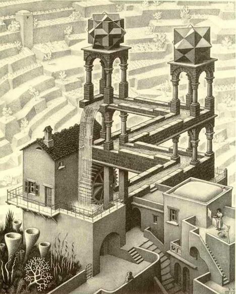
arnaud
One of my favorites is this one by Escher
arnaud
Sponsors


