Lettering critique please

dclevinger

Elite Cafe Member
Joined
Nov 9, 2006
Messages
267
Location
Arvada, CO
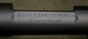
Just did this one for a local gunsmith. It's a barreled action for a custom bolt action rifle. The height of the oval shaped area is about half an inch and to make it more interesting, it is also concave. This is the first time I've done lettering on a dished out surface. It's also done on a matte finished gun which I pretty much only do for him. A single slip can cause the whole thing to have to be rebead blasted and eveything recut. Not much fun.:mad: One of these days I'll get a micro scope but this was cut using my Optivisor and 10x loupe. Please let me know what you think.
David
 

Attachments

  • gunmaker.jpg
    gunmaker.jpg
    108.5 KB · Views: 277

Andrew Biggs

Moderator
Joined
Nov 10, 2006
Messages
5,034
Location
Christchurch, New Zealand
Hi David

Looks pretty darn good to me. Nice spacing between letters, everythings centred, it flows well and no spelling mistakes.

The only thing I can see is the spacing between the O and U. Maybe the U moved to the left slightly but that's just the signwriter coming out in me. Looks great.

Cheers
Andrew
 
Last edited:

Marcus Hunt

~ Elite 1000 Member ~
Joined
Nov 9, 2006
Messages
1,799
Location
The Oxfordshire Cotswolds, England
Very nice indeed. I agree with Andrew but overall it's very good.

If I were to get really picky there are books on engraving letters and exactly what their proportions to one another are but I rarely use one. The only comment I would make is that when cutting Roman lettering all letters with a straight edge should run exactly on the line; rounded letters like the letter O or C should just cut through the line. If for or some reason if top and bottom of the O or C only touch the line (as per straight edged letters) they look slightly smaller. I don't know why this should be so but it does; some kind of optical illusion perhaps. Be careful though the difference is tiny and it's easy to over do it.
 
Last edited:

Sam

Chief Administrator & Benevolent Dictator
Staff member
Joined
Nov 6, 2006
Messages
10,491
Location
Covington, Louisiana
Good job, David. The roman's are well cut, and good advice from Marcus about letters with round tops and bottoms extending slightly past the guidelines. A roman "S" can be tricky to lay out, and what I do is to draw an "8" with overlapping upper and lower halves and use that as my guide to create an "S".

Can't see the script that well in the photo, but it looks good. / Sam
 

FANCYGUN

~ Elite 1000 Member ~
Joined
Nov 10, 2006
Messages
1,842
Location
West Grove, PA
Hi David
It looks like you deepened some of the fine lines of the letters since i saw it on sunday. Looks better. The script still looks good.
Thanks for the dessert before I headed home up over the mountains.
Marty
 

fegarex

~ Elite 1000 Member ~
Joined
Nov 8, 2006
Messages
2,061
Location
Ludington, MI
David,
It looks very nice. I think the others have given you good pointers. Working on a bead blasted surface is terrible!! The gravers don't want to cut as well plus it doesn't allow any sanding afterwards. Steel is always harder to get the burrs clean compared to silver or gold. You done good!
 

dclevinger

Elite Cafe Member
Joined
Nov 9, 2006
Messages
267
Location
Arvada, CO
Thanks very much guys. I'm not sure how, but I completely forgot about extending the O,S and U. Oops. My excuse is that my head was still spinning after hanging out with Lee and Marty. Yeah, that's it. The real good news is that the customer liked it so much that he wants it done on most of his custom rifles so I'll have plenty of chances to perfect it.

Something interesting also happened with this one. For all of my lettering I use a 120 and a flat but after popping the point off my 120 twice in about 2 minutes I switched to a 90. Not one problem after that. Both gravers are the same material so it should have been the opposite way around. Oh well. Thanks again and I'll try to post more stuff for critiques soon. David
 

Ron Smith

~ Elite 1000 Member ~
Joined
Apr 6, 2007
Messages
1,455
David, those who have had experience with roman letters understand how difficut they are to get right. I think your job is exceptional. The script is a little hard to see, but it looks good too. You customer will also not be nearly as critical. Good job my friend!.......Marcus' suggestion will work well for you. I personally usually engrave the flat top letters along the inside of the line, as it is easier to get the height accurate and consistent when you can see the line and cut along side it. I cut the round top letters on the line....The reason for this phenominon is the horizontal lines of the flat top letters are definate height indicators and any variation in them shows, particularly on very small lettering. The round top letters are limited in their ability to express their height being round...does this make any sense?...Ron S
 

Glenn

Elite Cafe Member
Joined
Nov 9, 2006
Messages
714
Hi David,
It was good to meet you in Denver. Can you tell me what action you are cutting these letters on?Thanks, Glenn
 

dclevinger

Elite Cafe Member
Joined
Nov 9, 2006
Messages
267
Location
Arvada, CO
Thank you very much John, Ron and Glenn. Ron, I'm going to try your way on the next one. It sounds like it would be easier to stay consistent that way.
Glenn, it was great meeting you as well. The action is a stainless Remington 700. It cut pretty well, a lot easier than s/s Winchesters.
David
 

russ

Member
Joined
Nov 12, 2006
Messages
85
Location
Denver
Looks real nice to me David.

"The real good news is that the customer liked it so much that he wants it done on most of his custom rifles"
That's what counts!

Good Job
Russ
 

Mike Cirelli

~ Elite 1000 Member ~
Joined
Nov 8, 2006
Messages
1,690
Location
Western PA
I think you did a wonderful lettering job there David.
Sam Thats seems like a great tip for the letter S.
 

Latest posts

Sponsors

Top