ihsfab
Elite Cafe Member
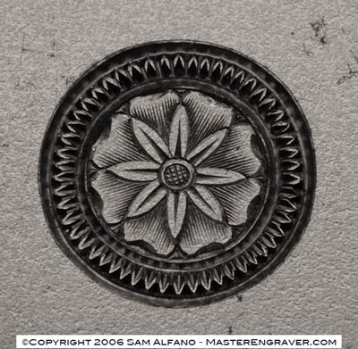
I used Sam's basic design, its not perfect but it looks awesome from across the room . It was fun to cut.


. It was fun to cut.