
Doc Mark
~ Elite 1000 Member ~
Hopefully, I will finally understand the magic needed to take digital photos and get them sized correctly for posting! I've been struggling all night taking these photos and then cropping them and trying to understand how to reduce them to less than 800 x 800 pixels for posting. Let's see if it works!
These are my first attempts at coin carving. The first one is just a new nickel I experimented with. I carved it too shallow, but I was still trying to figure out how to do it. The second "Johnny Reb" was done on a "legitimate" Buffalo Nickel. Not a "full horn" but pretty good quality coin.
Please evaluate and critique at will, I know I've got a lot to learn as a Newbie!
Mark
Attachments
-
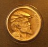 Rebel Nickel.jpg120 KB · Views: 215
 -
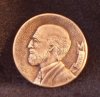 1st Hobo nickel.jpg109.8 KB · Views: 194
 Those are too sweet! Dwayne


