
KatherinePlumer
Elite Cafe Member
Hey everyone! I hope you all enjoyed (and are still enjoying) the holidays. I've been eagerly waiting to show some new stuff here, I had to wait til after Christmas though! It takes me ages to get through all the photos and figure out what to say. Bear with me.
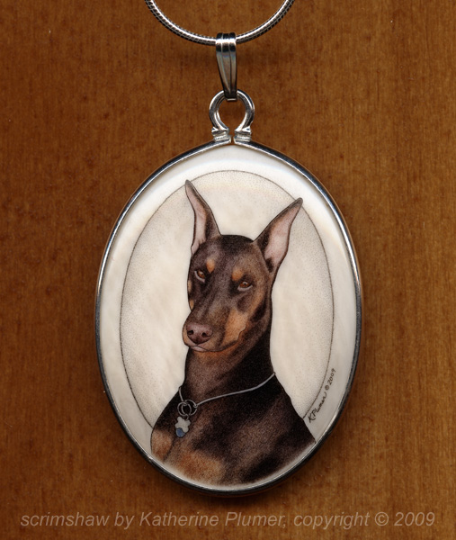
This project is a pendant featuring a Doberman Pinscher dog named "Rosie." It's a 30x40mm pre-ban elephant ivory cabochon, set in sterling silver, and it was a commissioned Christmas gift. I scrimmed it in full color, and it used 8 different mixes of ink. So I guess you could call it an 8-color scrim! I'm also big on gradation and tonality, so there is light and dark within each color of ink. It takes me a loooong time to build up the layers from light to dark, and then to layer the various colors. But the process is so worth it to get the right look!
This isn't exactly a tutorial, I'm not explaining anything. ;-) But I'll show you the work in progress pics. These are photographed under various lighting conditions over several days. Please pardon the weird yellowish tone to some of the pics.
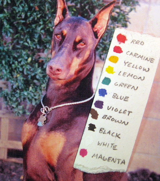
So, the client sent me one photograph to work with. Others were available, but this was the desired pose and expression, and I didn't really need other pics. The photo was not particularly well printed and the color was pretty tweaky, but I knew this dog (she passed away several years ago) and am familiar with the red Dobie color so it was fine. I decided just a head/shoulders portrait would be best, since putting the whole dog on that shape of ivory would leave too much blank space. The first step of course was sketch it out and transfer the image.
Straight out of the bottles, these are the colors of ink I have. One of the challenges is always figuring out the exact formula for how to mix every color that I need. Plus, the color in this photo is pretty bad. That's where knowing the subject matter comes in handy!:
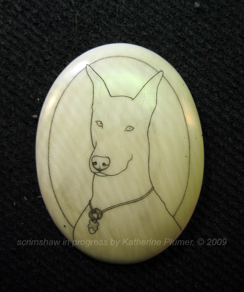
The outline lightly transferred to the ivory (out of focus, sorry):

The outline heavily scrimmed. That's not really something that has to be done, it's just my style of working, I think it helps make tiny images a little easier to "read"!
Okay, so at this point I had this major dilemma of what order I wanted to work in. Originally I was thinking I'd start with the darkest areas. But I didn't want to. I want to go light to dark like I'm drawing even though I think most people go dark to light. ;-) Yes, that right there is the extend of my rebellious streak I think! But I figured doing the eyes and nose first made sense:
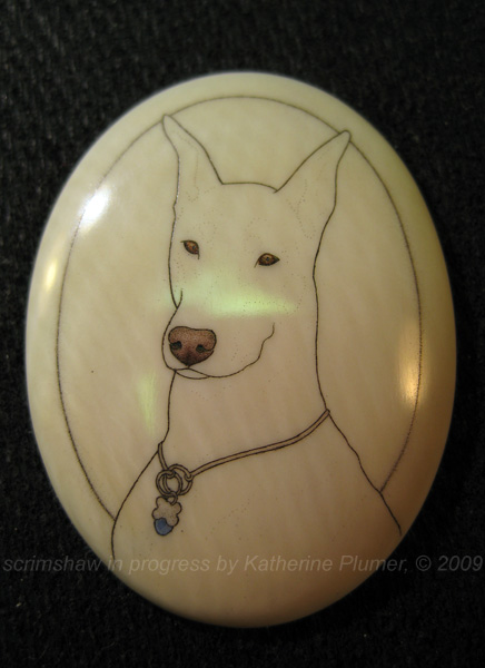
And then the pink of the ears and muzzle:
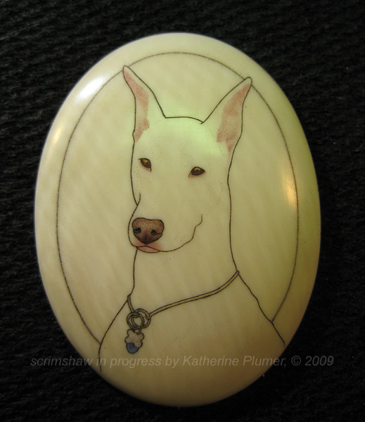
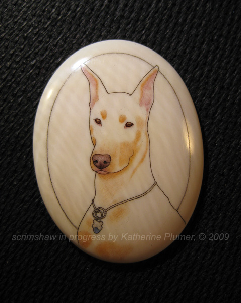
Then all the tan areas (this took a few layers to get it dark enough, but I didn't photograph all that):
Starting the dark reddish brown:
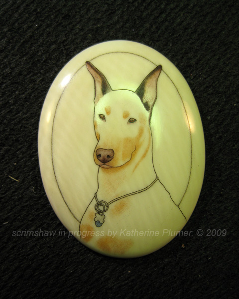
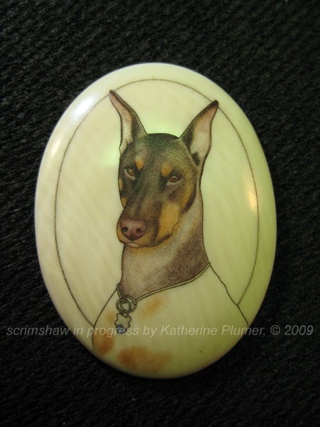
Building up the dark color on the face:
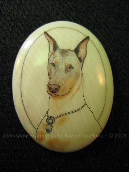
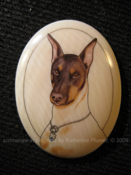
Starting work on the neck:
Then I forgot to photograph it for a while until all the dark color was on:
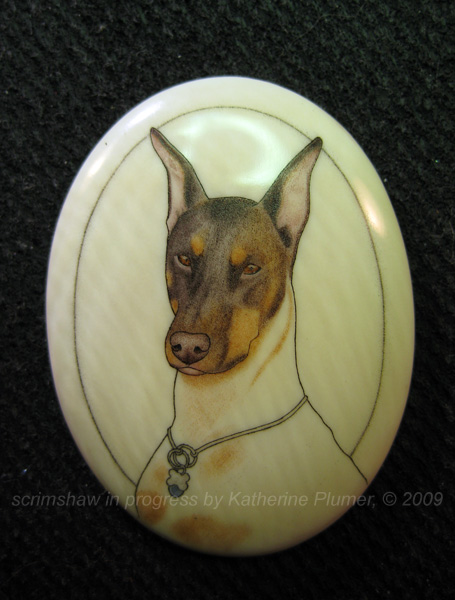
Added a darker tan to the tan areas (yes, I do sometimes "backtrack" to work on colors):
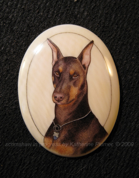
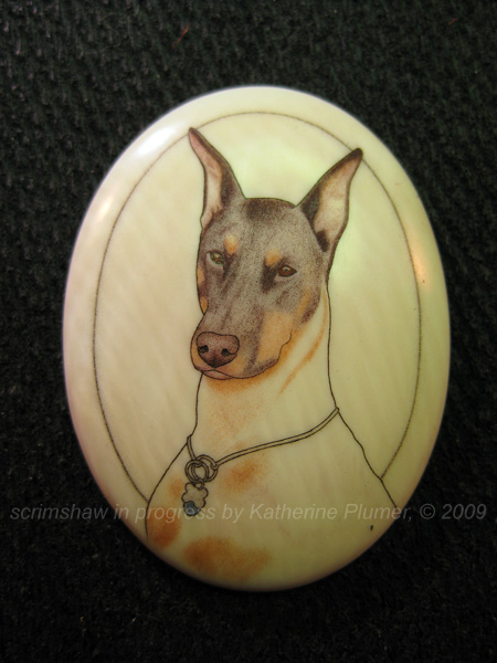
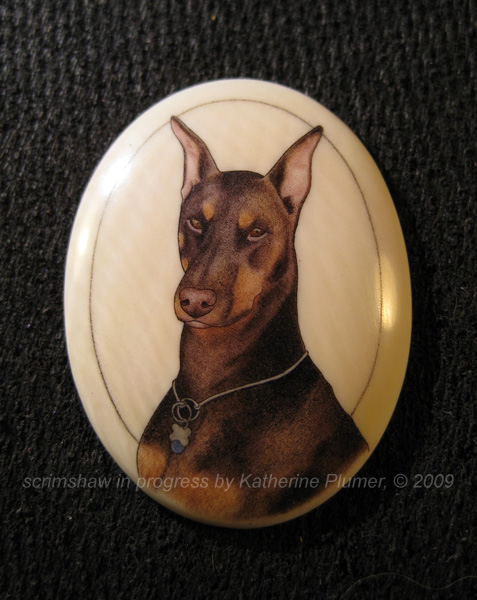
At that point all that was left was to darken the darkest brown areas with the last layer of color. And then it was done!
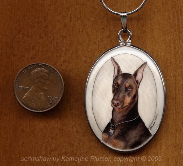
And with a penny for scale:
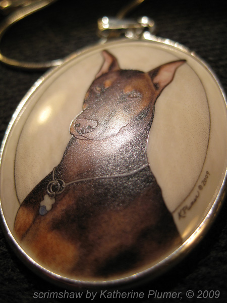
What I hope you can see in this pic is that it ends up pretty heavily engraved, though you can't really feel it much with your fingers. There is NO surface ink. It's all down in the dots, and I buff these things down quite hard between ink layers!
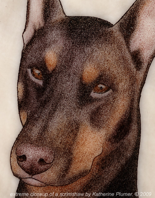
This is a very extreme closeup, like you're not really supposed to see them quite this close up, but it's interesting nonetheless. Lots of dots!
The recipient of this pendant loves it. She cried. Awwwww.")
Thanks for looking!
-Katherine
This project is a pendant featuring a Doberman Pinscher dog named "Rosie." It's a 30x40mm pre-ban elephant ivory cabochon, set in sterling silver, and it was a commissioned Christmas gift. I scrimmed it in full color, and it used 8 different mixes of ink. So I guess you could call it an 8-color scrim! I'm also big on gradation and tonality, so there is light and dark within each color of ink. It takes me a loooong time to build up the layers from light to dark, and then to layer the various colors. But the process is so worth it to get the right look!
This isn't exactly a tutorial, I'm not explaining anything. ;-) But I'll show you the work in progress pics. These are photographed under various lighting conditions over several days. Please pardon the weird yellowish tone to some of the pics.
So, the client sent me one photograph to work with. Others were available, but this was the desired pose and expression, and I didn't really need other pics. The photo was not particularly well printed and the color was pretty tweaky, but I knew this dog (she passed away several years ago) and am familiar with the red Dobie color so it was fine. I decided just a head/shoulders portrait would be best, since putting the whole dog on that shape of ivory would leave too much blank space. The first step of course was sketch it out and transfer the image.
Straight out of the bottles, these are the colors of ink I have. One of the challenges is always figuring out the exact formula for how to mix every color that I need. Plus, the color in this photo is pretty bad. That's where knowing the subject matter comes in handy!:
The outline lightly transferred to the ivory (out of focus, sorry):
The outline heavily scrimmed. That's not really something that has to be done, it's just my style of working, I think it helps make tiny images a little easier to "read"!
Okay, so at this point I had this major dilemma of what order I wanted to work in. Originally I was thinking I'd start with the darkest areas. But I didn't want to. I want to go light to dark like I'm drawing even though I think most people go dark to light. ;-) Yes, that right there is the extend of my rebellious streak I think! But I figured doing the eyes and nose first made sense:
And then the pink of the ears and muzzle:
Then all the tan areas (this took a few layers to get it dark enough, but I didn't photograph all that):
Starting the dark reddish brown:
Building up the dark color on the face:
Starting work on the neck:
Then I forgot to photograph it for a while until all the dark color was on:
Added a darker tan to the tan areas (yes, I do sometimes "backtrack" to work on colors):
At that point all that was left was to darken the darkest brown areas with the last layer of color. And then it was done!
And with a penny for scale:
What I hope you can see in this pic is that it ends up pretty heavily engraved, though you can't really feel it much with your fingers. There is NO surface ink. It's all down in the dots, and I buff these things down quite hard between ink layers!
This is a very extreme closeup, like you're not really supposed to see them quite this close up, but it's interesting nonetheless. Lots of dots!
The recipient of this pendant loves it. She cried. Awwwww.
Thanks for looking!
-Katherine
Last edited:


