
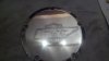
Hi all, this is Harley derby cover (about 6.5") that I did for one of the guys in our club. The logo is our club logo. This was my first time to try something this big. I was experimenting with how deep/bold to cut the different parts of the thing, and as you can see, it's not real consistent. For example, the large "B" did not seem bold enough as I was doing it, so I got heavier as I went along. my buddy likes it, but I'm thinking I should go back and re-cut the parts I don't like. Suggestions/comments welcome.
Attachments
-
 Nov 2012 phone Dump 035.jpg43.6 KB · Views: 242

")


