RyanColyar
Member
- Joined
- Sep 10, 2018
- Messages
- 28
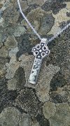
I'd appreciate any constructive criticism on this work. It's on hand fabricated argentum sterling silver (35mm x 14mm). The hare is in honor of St. Melangell if you were wondering.


Last edited: