Question: Background tread, stipples or cuts

Arnaud Van Tilburgh

~ Elite 1000 Member ~
Joined
Oct 3, 2008
Messages
4,221
Location
Belgium
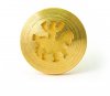
Yes this another version of the Lionhead.
And I know I started a tread in the past about background.
Now this one as quite a lot of negative space, and the one I already posted even more as it was bigger.
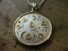
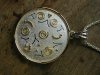
The bigger one I used a bur to remove the background and then stippled it. But in a way it is very hard to have the stippling uniform as it seems to me that the tool has to be 90° on the surface, otherwise, although it will look black, looking at it at a different angle one see it is not totally uniform.

That is why I tried this method, removing the background with even horizontal lines, one by one. It gives quite good control and at least the background looks nice from all viewing points.

Yes, this is a very blown up photo, otherwise I can’t show it properly.
And sure the smaller parts looks even more uniform, but I could practice on this to make it look even better. I also don’t like bur and stippling that much, as it is boring. Using a graver is more fun.

My questions are:
-is this way of handling with background inferior to bur and stippling?
-does it need more passes with different angles to be perfect?


arnaud
 

Doc Mark

~ Elite 1000 Member ~
Joined
Nov 16, 2006
Messages
1,284
Location
Hampton, Virginia
Arnaud, I have done this in the past and I like the effect. I did not like the effect when the lines were not all going the same direction. If you try to cross-hatch the lines, then the reflections change and it no longer looks black with standard overhead lighting.
 

Arnaud Van Tilburgh

~ Elite 1000 Member ~
Joined
Oct 3, 2008
Messages
4,221
Location
Belgium
Thank for your input Doc, Ron's book is talking about this technique, but crosshatched.
Seems also he experimented with different techniques.
Maybe a second pas over the first, say 20° or less could make it look even better.

arnaud
 

Marrinan

~ Elite 1000 Member ~
Joined
Nov 11, 2006
Messages
2,917
Location
outside Albany in SW GA
Arnaud, The use of parallel lines is the basis for graver background removal. These lines are called "witness lines" and if you create them with a single point graver of what ever Angle (90 110 120 ) and maintain consistent width you will have consistent depth. If you use a flat to remove the high ridge you will end up with very consistent flat background. They are often cross hatched before using the flat then the peaks removed. If this leveling is done with a liner you get a fine line even background. This has been done for a very long time and about everybody who does not use rotary does it this way. Leaving the ridges wil most often result in highlights as the object is handled and wares as the ridges are polished. To use the lines as background you will most likely have to releive first then cut a set of lines either with single point or liner to minimize this ware polish. Fred
 

Arnaud Van Tilburgh

~ Elite 1000 Member ~
Joined
Oct 3, 2008
Messages
4,221
Location
Belgium
Fred, thank you very much explaining this. It is clear to me what you describe.
I’m always in to know how the older techniques works.
I have some liners I just prepared to give it a try.
Now, instead of using a single point to do the lining, I can also use a liner, and I experienced that when giving it some passes, the negative space is lowered and at the same time I have equal parallel lines on this lowered background.
But I suppose the liner does not work on tiny spaces, so one has to handle these parts with a singe point?

I also understand that if the negative space is not cut deep enough, the ridges will most often result in highlights when “polished” as the object is handled.
Now for bigger negative space, I think it does not matter much how deep the negative space, as it will be “polished” anyway.

Another problem however using a liner like I have some, is that the individual points of the liner are a bit rounded, and don’t show up so black as a C-Max.
Is this because I have bad liners and do I have to make one myself?

Thanks again for your support, arnaud
 

Arnaud Van Tilburgh

~ Elite 1000 Member ~
Joined
Oct 3, 2008
Messages
4,221
Location
Belgium
I have been practicing with some different tolls now.
I used a liner, but I think it is not the best option for me. Sure the lines could become more parallel than using single point, but they don’ look that black than single point.
The reason is that I use Chris Decamillis geometry, and as he showed, the C-Max produces darker lines the wider the angle of the graver. I use mostly 110°

Now removing background with a single point 110° C-Max is quite easy and works fast too. And it produces a uniform pattern that I like, and it is very black.
The problem that could appear like Fred pointed on, is that the ridges could result in highlights as the object is handled because the background is not lowered.
But like I do the cuts one by one, placing the graver just on what would become a ridge, I lower the negative space at the same time.

My next project I will remove the background like that, using single point and see how it will look. So far I’m quite pleased with the result and it gives very good control, even better than the tiny burs 0,20 mm I used in the rotary tool.

arnaud
 

Arnaud Van Tilburgh

~ Elite 1000 Member ~
Joined
Oct 3, 2008
Messages
4,221
Location
Belgium
As one photo only shows one view point, I made a video, as I think this shows much more than a still image

http://www.youtube.com/watch?v=8-ACm6ibhTw

And sure stippled background looks good from one point of view, but I have always struggled with the other point of views, as they sometimes don’t look the way I would like them to be.
Now, this one is the first one with this kind of background, but I’m already convinced I will do my backgrounds only this way, as it look nice from any view point. It can change from black-white to white –black and everything in between.
In my opinion it makes a engraving more alive.


arnaud
 
Last edited:

Arnaud Van Tilburgh

~ Elite 1000 Member ~
Joined
Oct 3, 2008
Messages
4,221
Location
Belgium
About the difference between stippling or lines I have added a VideoBlog to Chris engraversstudio that shows better the difference as a single still image if it.

I hope it is more clear this way what I try to show.

arnaud
 

Mario Sarto

Elite Cafe Member
Joined
Jul 30, 2008
Messages
611
Location
Bad Salzuflen
Hello Arnaud, like Andrew i watched your videos and i see what you mean.
First - the blackening with lines suits very nice to the piece with the lions head, it looks good and very equal.

But i see a downside using this also. Doing this on a relative large area, and in my humble opinion the area is large on the pendant, you produce a very delicate, damageable surface. A little scratch on it it would stand out like the "Leaning Tower of Pisa". Please don't get me wrong, it looks good to me, but removing a scratch would take a lot of effort, just because this kind of work lives from its perfect execution. Removing scratches needs to lower a part of it, this would suffer the good looking touchy.

The other pendant you did by stippling is good, too. But again, it is a large area and in this case you failed a little bit , because you left the equal execution. Between the stippling you have changed the angle and the direction, you did not hold the tool equal all the time. But this is essential if you like to reach a uniform area. This little lapse could be clad by using ink - what Andrew said.
The big pro i see - comparing to the line method - scratches could be easily removed.

Just my two cents
Mario
 

Arnaud Van Tilburgh

~ Elite 1000 Member ~
Joined
Oct 3, 2008
Messages
4,221
Location
Belgium
Mario, thanks for taking the time as well.
Yes it is a quite big area that needs the black. And that is why indeed it becomes more fragile. But I think there is not that big difference in fragility if a large piece of background is stippled or lined. Even if the background is lower would not make it less fragile for scratches.
Now what happens in my opinion when a pendant like this is wear, everything that will touch the surface that has equal hardness, will burnish it. So after some time there will be highlights.
Now in my opinion, when the structure of the background is equal, so will be the burnishing.
I think it will not look that bad than, just that the background will become more grey as there will be lighter parts on the ridges of the cut lines.
I also experienced that this also happens with stippled background.

And as a goldsmith you also know that jewellery looks perfect once you have finished it and its finishing touch just gets down once one wears it. Jewellery is of course made to wear it, so there is no other way.

Now I also have a big dog, and I used here already to find out what happens when someone wear a Titanium engraving by hanging a pendant on the dog collar.
So I will do this again with a sample of both techniques to find out.
One of the reasons I think Titanium is great for engravings is its hardness. Silver for sure will be more fragile to scratches.

I also will try out how this lined relief background will look on white gold. That because I experienced that a stippled background on both white and yellow gold looks real bad as it never looks black. Perhaps a lined background also can solve that.

You are also right about the way I did the stippling, yes the stippling has to be done in only one direction to become equal in texture. I will experiment with that also to find out.

arnaud
 

Marcus Hunt

~ Elite 1000 Member ~
Joined
Nov 9, 2006
Messages
1,799
Location
The Oxfordshire Cotswolds, England
Hi Arnaud, a lot of traditional gun engraving involves background removal with a single point but the areas are not as large as you have here. Personally I'd remove the background with a flat and stipple. Forget rotary tools on large areas such as this because, unless it's milled out with a machine, I fear that you'll end up with all sorts of differing depths.
 

Christian DeCamillis

Elite Cafe Member
Joined
Nov 9, 2006
Messages
639
Location
Traverse City, Michigan
Personally speaking, I think that the background just has to create contrast. I think that when it comes to jewelery especially gold yellow more but also white. When you color yellow with black to me it looks terrible. If I am going to color it I use Burnt umber a deep chocolate brown. This warm tone lends itself well with yellow. For Gold I prefer to stipple it with a polished stippling tool so it has contrast and sparkle much like the stippling from using a diamond stippling point. It is much richer looking in my opinion.

Somewhere along the line everyone decided that the background needed to be super black and for me I don't agree. I do it all the time because that's what customers have come to expect. The custom knife makers all say make it real black. When You put in the paint you loose the sparkle and the life of the background.

I have and do use what Arnaud has done for gold it's great. Yes there will be wear but most of the time with jewelery we don't refinish a piece every time someone wants it cleaned up . Usually a little polish and cleaning in the ultrasonic. The problem with jewelery in general is that when you have an object made of soft material and it's highly polished it's going to get scratched a nicked no matter what. The wear is usually uniform. This holds true even for steel hardened or not.

I like this kind of background for many of the reasons Arnaud has stated. It was used a lot on the old Parker's and still today on Hollands. I also think that if we as artists started to stipple backgrounds and make them as black as can be done without paint it would catch on. Mario it is true that if you don't move the tool position it will be more even, but if the tool dulls or breaks a little during the process it will change no matter what. I have done some backgrounds using different burs as stippling tools and gotten some nice results as well. Keep an open mind remember that these things are viewed from many angles and not just as shown in a picture so try something a little different. you may be surprised by what you may discover, Look what happened when I experimented with different geometries and polishes on graver's. Before that no one would have thought that a wider geometry would give a darker line , let alone that polishing would help as well.

So keep on with experimenting and show your results and see what people like instead of doing it a certain way because that's how it's done or always has been done. You are only stifled by your own imagination and the rules of others. break free and be an artist .

INOVATE don't IMMATATE.

Thanks Chris
 

Mario Sarto

Elite Cafe Member
Joined
Jul 30, 2008
Messages
611
Location
Bad Salzuflen
Hello Chris!
I agree to what you wrote ...

Somewhere along the line everyone decided that the background needed to be super black and for me I don't agree.
... but not here ;)
Like you i never have seen the necessity to receive the total black. Especially not in the field of jewelry - but in the case of engraving steel, there are pieces, where i love the dark matte black background. It sometimes pops out the artistic work of the engraver, also or even in combination with the warm color of inlaid gold.
To make it short, for me it depends on what i like to achieve.

Mario it is true that if you don't move the tool position it will be more even, but if the tool dulls or breaks a little during the process it will change no matter what.
Of course you know that, my, sorry, our (Andrew wrote it before) hint to use color on the piece in the video he stippled, was to cover the shiny surface, which shows different angles and directions. With matte color on it, it wouldn't show the different areas in the way it does now (i know it was a practice piece, Arnaud, you told that in the video).

Of course it would be better to have a equal surface. Below are three pictures, which shows, what i mean. The pendant was done by a student of mine in her first year. She did the hole thing by hand - holding the stipple-tool in one hand and the hammer in the other. I taught her before, how to do it. Although she didn't catch the complete surface, the area looks steady from every point of view.
The third shows the use of the stippling-tool with the GraverMach. I did not change the angle here and you will see it is very smooth.

To lower the risk of different angles on the tool itself, i always use the same angle, when resharpen it.
The last thing i like to add on - in my experience a deep stippled surface (on jewelry!) needs to be treated after, that could be a gilding or something in that direction. If it is not done, it looks quickly dirty.

Regards, Mario.
 

Attachments

  • ohrstecker-sonnenreiter-gold-04.jpg
    ohrstecker-sonnenreiter-gold-04.jpg
    90.9 KB · Views: 32
  • Anhänger Silber-Gold No 3.jpg
    Anhänger Silber-Gold No 3.jpg
    76.1 KB · Views: 32
  • Anhänger Silber-Gold No2.jpg
    Anhänger Silber-Gold No2.jpg
    115.5 KB · Views: 31

Arnaud Van Tilburgh

~ Elite 1000 Member ~
Joined
Oct 3, 2008
Messages
4,221
Location
Belgium
Mario, thanks again for participating on this.

First of all you quote me from the video “(i know it was a practice piece, Arnaud, you told that in the video)” I have played both videos two times and can’t find hearing me saying that. What could be misunderstood is that I’m saying “I have two examples” but that is not the same as practice piece.
I could be wrong, however they are not practice pieces. Just an existing logo I use to make a pendant for selling.

I agree with you and Chris that a background not always have to be deep black. But in this case, the logo is just black&white and that is why I wanted the black look black.
Sure a background can have any tone (black-grey-white), as long as it has some contrast with the other parts. Perhaps it even don’t has to be equal all over the area. I mean you could use more black touching the borders and lighter in the centre. But that does not mean the stippled example on the video looks good. As the differences in tone don’t make any sense.

I also agree that I stippled almost everything the wrong way for two years. In a way it was never told to use the same angle, or I missed it. Doesn’t matter, I know it now and I will give it a try too.

About “gilding” do you mean like electro plating with Rhodium? I agree it looks dirty when not treated. But if yellow gilding would help on yellow gold, I learned something new.

BTW, nice work you show here as examples

arnaud
 

Andrew Biggs

Moderator
Joined
Nov 10, 2006
Messages
5,034
Location
Christchurch, New Zealand
Hi Chris

Yes, I agree with everything you are saying............the idea of the background is to create contrast and be a part of the overall design. After all, one cannot be separated from the other. But it all depends on what it is you are trying to achieve and the look that you want. There is no rule that says stippling has to be black. As Mario has clearly shown in his photos it can be used all by itself to add texture which gives the required contrast to the piece.

For instance, when carving or chasing a neutral smooth grey with a very light frosted texture can look best so it helps with the natural light shadowing of the work. In fact it helps create even more depth. A very small pearl/beading tool can give a beautiful and lush satin finish...... Some backgrounding techniques are more suited to certain styles of work than others. Some backgrounds that reflect and change in the light just look awful and don't enhance the work whereas in other cases it can...........And on and on it goes.

The line technique for backgrounds is a very old one in the decorative field of arms and armor and the printing field. As you know, it is the build up of lines from various directions that will give you black in scene work using the various bulino techniques of dot and line. So there is nothing new in any of this as it's all been done before and still being done.

But in this case Arnaud is talking creating "black" as a background over a large area.........and good on him for experimenting around and trying these things out. We should always do that. Besides, it's fun to do and I would encourage anyone to try everything and anything. However I think he has shown a very poor example to back up his theory and by simply wiping black ink/paint into the work the problem is fixed. There is also a monetary case about time versus dollar but I won't get into that as we are talking pure technical theory here :)

It just strikes me as trying to reinvent the wheel. The real success of stippling a background is making sure that the field is as level as possible and the stippling is evenly done and as finely as possible (as opposed to large moonlike craters). No amount of ink will disguise those things if they aren't done properly. In some cases black is desirable as a background............in other cases black is not desirable. So it is always on a case by case basis that you decide what looks best for the work........then of course you get into individual taste and that really opens up a can of worms.

Then you start entering into the realms of what finish/effect will last the longest for the canvas. A collectors item that is rarely handled can have more of a fragile finish. Something that is going to be used and abused every day has to have a more robust finish that will give the customer the longest life possible. So there are a lot of factors that come into the work and all the design features have to be taken into consideration.

So it's not a matter of having an open or closed mind, immitating or innovating or following accepted norms. It is simply doing what is best for the particular job in hand and what you are trying to achieve. And in some cases black ink on stippling works very well for a desired effect of black.

Cheers
Andrew
 

Arnaud Van Tilburgh

~ Elite 1000 Member ~
Joined
Oct 3, 2008
Messages
4,221
Location
Belgium
Again I learned a lot in this tread that was meant to show another way of treading background. I think there is, like Chris says, not just one way.
Perhaps it seems I reinvented the wheel by showing a lined background, in a way I did reinvent the wheel as it is a logical result of my learning process.

I know I’m sometimes too exited, but that is just the way I am and want to share that with others. And I have been too long in the “dark”, not having “like-minded” creative people to share my creative experience.

Fragility, yes that could be a problem in any way. The more skills one has the more fragile his/here work will become. But as jewellery in my opinion is only meant to wear, otherwise it is furniture, is will show its history being wear.
And this makes it possible for those after us, to start all over with something perhaps similar as we made. That because some of our tiny scratches will be disappeared.

So for me the experience of using a lined background for the first time was exiting, and I just wanted you to be part of it as it can help all of us to explore more.

arnaud
 

Mario Sarto

Elite Cafe Member
Joined
Jul 30, 2008
Messages
611
Location
Bad Salzuflen
Arnaud, again, the area you've lined looks good to me and it fits nice to the lion head.

First of all you quote me from the video “(i know it was a practice piece, Arnaud, you told that in the video)â€￾ I have played both videos two times and can’t find hearing me saying that. What could be misunderstood is that I’m saying “I have two examplesâ€￾ but that is not the same as practice piece.
I am sorry, definite i got it wrong. Please accept my apology for this! I assure, next time i will be listening three times.
 

Latest posts

Sponsors

Top