
Riflesmith
Elite Cafe Member
Just a little sample plate with some Arabasque scrollwork, wanted to see how this would turn out.
Attachments
-
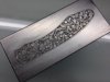 image.jpg54.6 KB · Views: 357
 -
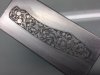 image.jpg60.5 KB · Views: 353
 -
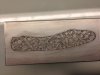 image.jpg54.8 KB · Views: 351
 -
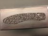 image.jpg58 KB · Views: 352


