Critique Request A blue leaf. [photos]

Jörmungandr

Elite Cafe Member
Joined
Jan 30, 2012
Messages
100
Location
Västernorrland, Sweden
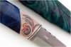
My most recently finished one! This is a "practise" knife before my next project which will have alot of engraving done on the handle.

Anders Hedlund blade, reindeer antler and stabilized birch burl in the handle. Sheath is made by half-tanned leather. And a wee engraved silver button for the belt loop.


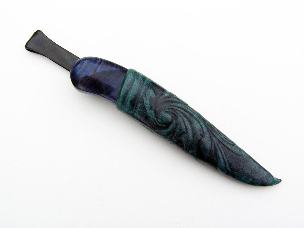
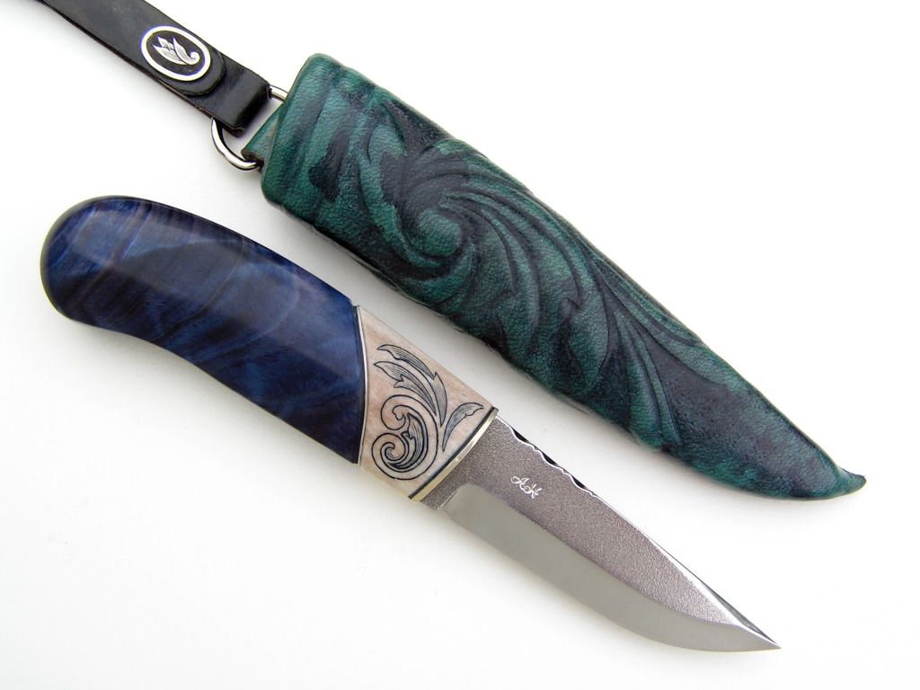
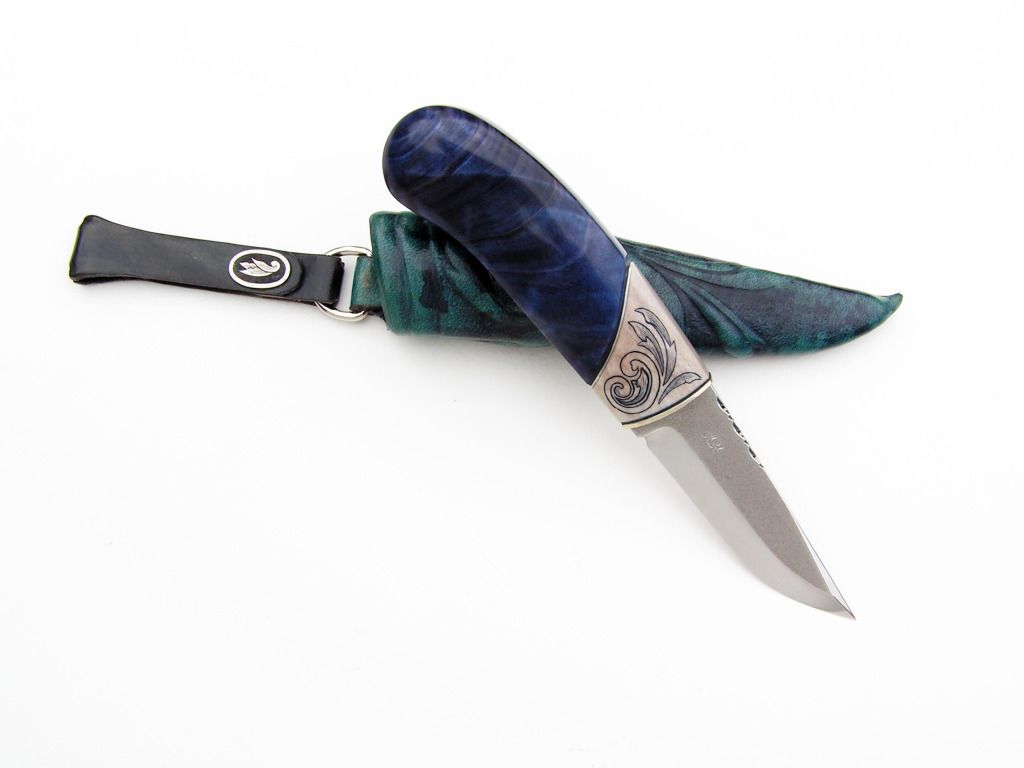
Anyone got any critique? Fire away! I welcome it all :)

//DQ
 

Arnaud Van Tilburgh

~ Elite 1000 Member ~
Joined
Oct 3, 2008
Messages
4,221
Location
Belgium
DQ, okay as it seems no one can comment on this, I give it a try. Just my thoughts of course.

First of all, sure that is a nice knife, so you have to do the best you can to decorate it with an engraving, otherwise don’t engrave it until you know what you are doing. And by the time you know what you are doing, you won’t ask for comments here in the café.

First of all, your shading just shows greys. The goal of shading is to ad dimension. So you need to add greys and black and everything in between.

Second, you didn’t connect the leaves to the backbone, so that could look nice using another style, but this way it is hard shading it with dimension. The overall design only comes to live when you show what is in front and what is in the back.

So to me it seems you don’t really know what you are doing. My way is to start drawing a backbone that fits the area you want being engraved.
After that it is quite easy to ad leaves. Then work on the shading.

Most important is that before you ruin a nice knife, that you start with a plan, so you must start drawing first till you can’t do better, then show it to the world if you want some comments. You will learn a lot doing it that way step by step

And remember, don’t make it yourself easy, if there is something you don’t like, no one else will

arnaud

Here is a backbone I could use, just adding leaves
 

Attachments

  • newone.jpg
    newone.jpg
    308.5 KB · Views: 240
Last edited:

tim halloran

Elite Cafe Member
Joined
Jun 10, 2008
Messages
317
Location
Blue Grass, IOWA
Jormungandr: I think it looks appropriate for this knife, especially being that your working on bone rather than steel. Bone will not tolerate fine shading lines like steel will.You could use dots, as in scrimshaw to high lite the background and leave the scroll elements plain with little or no shading . Just my thoughts.
 

Marrinan

~ Elite 1000 Member ~
Joined
Nov 11, 2006
Messages
2,917
Location
outside Albany in SW GA
Jormungandr, I would like to say up front that I really like the style of your knives. All you have shared have a simplicity of design that hide the masterful skill of your work. I am certainly not qualified to make any judgments on your scrim work. I would suggest that, based on your knife style and your heritage and the trouble with shading this particular piece of bone that the rose-mail style would have worked a little better than the gun style. Just my opinion-everybody has one and that's mine. I look forward to more of your work-Fred
 

Jörmungandr

Elite Cafe Member
Joined
Jan 30, 2012
Messages
100
Location
Västernorrland, Sweden
Mr. Halloran, you are right in that antler and bone is very different to shade on, alot harder than metal, for several reasons. I was thinking about the use of scrimshaw techniques for shading actually, but ruled it out since I wanted to keep it a purely engraved motif. However, like you said, using scrimshaw to darken the background is not a bad idea at all. Thank you very much for your input.

Mr. Marrinan, thank you for the great response, fun to hear that you liked the way I build my humble works. You also gave me alot to think about regarding the style of the motif and how to further developing my engravings. I'll try and do some research about the local painting styles. The museums might have a few pieces.
 

Chujybear

~ Elite 1000 Member ~
Joined
Nov 3, 2011
Messages
1,079
Location
Haida Gwaii
I'm curios about the choice of color in the leather and wood.
I'm not so painterly , but the earthiness in the leather seems to clash with the entensity of the blue.
The ivory too seems to clash w the blue. But not the green.
I'm not really a scientist in this respect (color). But just my sense.
 

Andrew Biggs

Moderator
Joined
Nov 10, 2006
Messages
5,034
Location
Christchurch, New Zealand
Hi Jörmungandr

Your colour coordination is just fine. The blue, turquoise and ivory colors work together beautifully. It is an old tried and true colour combination that works.

In fact the whole thing is very nice indeed and looks great.

The thing that lets it down a bit is the engraving...........but that is okay. These things take time and effort and we all have to start somewhere.

There are 2 parts to your design. The scroll and the leaves. I can see what you are trying to do with the scroll and the leaf tucked inside it but it doesn't quite work. However, it could be made to work with a bit of development..................or, you draw a more traditional scroll.

Your leaves are almost there, but not completely. They don't have any character or life. That can be easily fixed in the future by giving the lines a bit of personality.

I will draw you up a couple of ideas to show you what I mean.........in the meantime, practice your drawing with pencil and paper. The actual cutting technique is the easy part. Everything else is the design, the design, the design. :)

Cheers
Andrew
 
Last edited:

Latest posts

Sponsors

Top