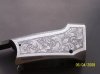
Here is the Winchester .22 rolling block I am working on and a "sling pin" fpr an early 1800's trade rifle. Comments are welcome....and I have tough skin!
Bill
Bill
Attachments
-
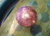 sling pin for Shively (2).jpg71 KB · Views: 232
 -
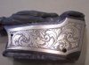 Winchester right side (2).jpg82.7 KB · Views: 323
")