
Willem Parel
~ Elite 1000 Member ~
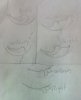
In cooperation with Caty this is the sketch I made.
So please start shooting on what's wrong and letting me know what is good will be much appreciated.
Willem
So please start shooting on what's wrong and letting me know what is good will be much appreciated.
Willem
Attachments
-
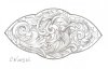 image.jpg75.1 KB · Views: 267


")


