You are using an out of date browser. It may not display this or other websites correctly.
You should upgrade or use an alternative browser.
You should upgrade or use an alternative browser.
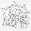
sketch
- Thread starter didyoung
- Start date
Cloudy
~ Elite 1000 Member ~
Really nice! I enjoy your work tremendously- thanks!
this one flows easily for me...when I first look at your drawings I sometimes react the negative space is being squeezed out by the leaf elements...but when you cut them they look terrific and I like them just as you drew them ....I appreciate you opening me up to your style and look forward to your posts 

Last edited:
didyoung
~ Elite 1000 Member ~
bthomas.
thanks for your thoughts and ideas.
i try to listen to everyones ideas, if i can use some i sure will.
shawn
thanks for your thoughts and ideas.
i try to listen to everyones ideas, if i can use some i sure will.
shawn
Arnaud Van Tilburgh
~ Elite 1000 Member ~
I always enjoy it when you post a new "sketch" All we do starts that way with a sketch.
Looks nice,
keep sketching
arnaud
Looks nice,
keep sketching
arnaud
Shawn, at least I think this is Shawn. I look at the aliases and sometimes do not know the person's name. This has some very nice elements and wonderful leaf shapes. Here are some suggestions you may consider. I drew this very quickly and not nearly as nicely as yours but you are a quick study and will likely understand what I am saying. If not then shout back. My reasoning for these other options is it will create more depth and layering in the final design. I think you will also find it easier to shade. Numbers 1, 2, and 3 are examples of having the leaf emerge from inside the preceding leaf. This will create the illusion that the top leaf wraps around the whole stem. Number 4 is an area where you have a number of major lines all merging and it will be difficult to shade it in a way that places one on top of the other. A small shift of a couple of lines will place one leaf above and the other below and shading the bottom leaf a bit darker will really create some nice layering and depth.
I did not go over the whole design but I think with these quick explanations you will find a number of other places in the design where a shift of the lines will change the look. Just another option to consider.
I did not go over the whole design but I think with these quick explanations you will find a number of other places in the design where a shift of the lines will change the look. Just another option to consider.
Attachments
didyoung
~ Elite 1000 Member ~
thanks lee thats what i needed!!!!
didyoung
~ Elite 1000 Member ~
another sketch with some new ideas.
really looking forward to cutting this one.
really looking forward to cutting this one.


