JIA
Elite Cafe Member
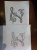
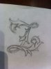
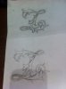
 I'm trying to draw Z letter with some leaf script with no luck
can some one plz help me out with a start or at least point me to the right direction how to draw it.!!
i looked at Sam instruction and the igraver tutorial and i cant seem to get it.
thanks for the help :bow::bow:
jakob
Last edited: