Okay, you asked for it! Just kidding really. I'll tell you what my art teacher told me years ago...LOOSEN UP! The flow and design is good, but a little too rigid still. Hope you see what I mean.
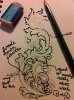
A pretty good effort but there are a few things wrong with it.
The scroll heads need to be leafy or balled or something. Pointy ends don't really work in most cases.
The shape of the scrolls needs a bit of adjusting as well.
The leaves are a bit lifeless and are growing in strange directions. Some are also to big and need to be broken down a bit. Plus a few more added to the overall design.
what I suggest you do is draw the same thing in a long triangle. This will give you borders to work to and start giving you an idea of proportion and balance. As engravers we are always working within strange shapes so you may as well get used to it from the start.
I've attached something for you to think about.
You are off to a good start and your drawing just need a bit more refining
The thing that caught my eye was the pencil shading - engraving is like pen and ink, where you either have a line or don't instead of pencil where you can smudge. Darn hard to draw engraving shading with a pencil though.
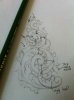
Thank you Andrew for that it really helps a lot. I am still confused by the scroll heads. I do understand that the pencil shading is different than line shading or crosshatching I am just trying to get am idea of what the shadows should look like. I need to start shading with cross hatching to understand it better. Here I what I did today let me know if it is any better.
1. The scrolls are now out of proportion. You can see by the arrows I have drawn that the scrolls are narrow at the top and wider as they go around. This has led you to squash the leaves at the top. Your scroll structure is absolutley important. If this is out of whack then everything else will start turning pear shaped.
2. I've pointed to some leaves that are a bit weird and look like nothing.
So here are a couple of tips for you to work toward. The first is draw a bit bigger at this stage. Drawing small to start with can be more of a hindrance than a help. The second is to buy the Ron Smith book about scroll design. This will be the best money you will ever spend. He goes into great detail about the acanthus leaf and how to draw it plus break it down. When you are drawing have the book next to you so you can see you can copy some leaves. After a while you'll get the hang of it and not rely on the book...........pages 49 to 71 are essential.
There are generally two types of scroll heads. One is a ball like you have now. The other is a leafy head. This can vary from simple to really complicated. If you look at the Italian engravers like Pedersoli and Creative Art you will see the ornate leafy heads they give to their scroll work.
So all in all you are doing well. A bit of refinement and more accurate scroll structure with a bit of leaf development and you will be well on your way
Thanks Andrew i will keep working at it. I realy apresheate that you take the time to show me what i am not getting right and thank you everyone for the advice.


")