Critique Request design for lighter

John Cole

Elite Cafe Member
Joined
May 19, 2009
Messages
131
Location
Oklahoma City, Oklahoma
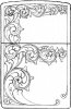
Here is a design that I just finished for a lighter project.
This pic. doesn't have the shading in it. I drew the design and then printed off a few copies for worksheets to work on the shading last night.
I hope to start cutting on it later today.
All thoughts are most appreciated.
thanks!
 

Attachments

  • zippo01L.jpg
    zippo01L.jpg
    122 KB · Views: 284

Sam

Chief Administrator & Benevolent Dictator
Staff member
Joined
Nov 6, 2006
Messages
10,491
Location
Covington, Louisiana
I like it a lot. My only nitpick is the two small scrolls in the lower right. I think I would do them as just the backbone and without the secondary line inside. It's a nice design though, and it's going to be beautiful. :thumbsup:
 

Red Green

Elite Cafe Member
Joined
Aug 19, 2011
Messages
391
First let me say that it is a very nice drawing and I'm sure will make a beautiful lighter. I certainly do not have Sam's knowledge of scrollwork but if you don't mind my saying so I see things that I find distracting and awkward, do remember I'm am being nit-picky.

In both transitions from vertical to horizontal you attach the scroll toward the end of the tendril, unlike the rest of the scroll. I have seen this before, it may be a 'traditionally used' but it almost always looks like a clumsy afterthought to me and it distracts from your really nice scrollwork. Splitting the leave in the upper left corner may be intended as a focal point and it may be effective but to my eye it is inconsistent with the harmony and character of the rest of the scroll. As Sam said "it's going to be beautiful" just as it is.

Bob
 

Andrew Biggs

Moderator
Joined
Nov 10, 2006
Messages
5,034
Location
Christchurch, New Zealand
That's a very nice design John.

The devil will be in the detail of shading so take your time and don't rush it. Study some excellent shading by Sam Alfano, Phil Coggin and Jeff Parke and you won't go wrong :)

Cheers
Andrew
 

rod

~ Elite 1000 Member ~
Joined
Nov 19, 2006
Messages
1,609
Location
Mendocino. ca., and Scotland
I am with Red Green here, John,

An excellent design, and well done, but some thought about flow will make it even better.

Having got the basic design ideas on paper, as you have, I always get value from doing a drawing of back bone only, and see if this flows nicely to your eye. There are a few discontinuities in the backbone that could be improved, after which your elements can be added.

You are within sight of the winning post!

It is going to look great...

Rod
 

John Cole

Elite Cafe Member
Joined
May 19, 2009
Messages
131
Location
Oklahoma City, Oklahoma
Thanks Guys!
I see what ya'll are talking about in the vertical to horizontal transition. I'm not sure I agree that it is a flaw, but I do agree that there several different ways to design into a space.
I plan on cutting several of these lighters, using them as inexpensive projects to help me work on design, layout and cutting. ;)
Bob and Rod, I will definately take your thoughts and work with them on the next design. I had already started cutting on this lighter, so I wasn't able to make any changes in the pattern.

Question: when cutting a leaf element with a tight curl going into a long smooth line, do you start the cut with the curl, or with the line and end with the curl? I tried both ways and haven't found a way that seems smoother or more natural for me. Thoughts?

Here is a pic of the lighter where I left off with it yesterday. It's a solid brass zippo.

as always thanks for the help, thoughts, input!

John
 

Attachments

  • zippo01_1.jpg
    zippo01_1.jpg
    56.6 KB · Views: 163

Red Green

Elite Cafe Member
Joined
Aug 19, 2011
Messages
391
I would not use the word 'flaw' it is just a personal opinion. I have not studied the use of the transition but from what I have absorbed I believe the best use of it is as an illusion, a extension of an obscure element that is meant to appear to pass through the primary scroll. I think this is the intent of the master work I've seen it used on, this is just a 'feeling' as I cannot say what others think as they design. This type of 'pass through' is evident in the second from the bottom picture from Bram's first post on this thread: http://www.engraverscafe.com/showthread.php?13903-English-scroll-for-your-help... as I said I am not the expert on scroll design, I just know what I like.
 

John Cole

Elite Cafe Member
Joined
May 19, 2009
Messages
131
Location
Oklahoma City, Oklahoma
Bob,
flaw was probably the wrong word. Thanks for the link to Bram's post, I had missed that the first time around.
I've got so much to learn and so much to work on. As I said earlier, I appreciate your thoughts from earlier, and plan to use them in the next set of drawings.

thanks
John
 

Latest posts

Sponsors

Top