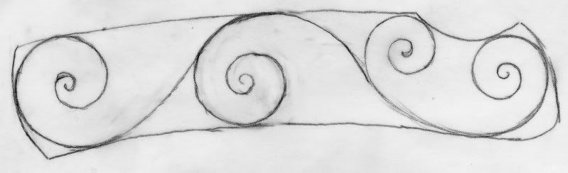
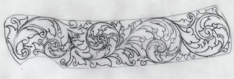
Ive been working on this scroll design for a quite a while drawing and redrawing and i feel that I've gone about as far as I can without some outside opinion. Id love to hear what people think and how i could improve it. Thanks, Jason
Hi Jbardon,
That's quite a nice design you have developed for your Buck knife.
A couple of things for you to consider, if I may.
The final curl on the initial scroll seems to be slightly out of line with the rest of the backbone where it comes out from under the twin leaves.
There are a couple of places where the backbone of the scrolls hit the outside edge line as you have drawn it. Is this the outside edge of the knife? Or is it a border line?
If it's a border line OK but bring the second scroll from the left up to touch it like the rest of the scrolls.
This second scroll is smaller than the third scroll and this is not quite right. Make it full size and let the last scroll in the line be smaller if need be.
One other thing, and maybe you like it this way.
Your design seems to be running back from the blade. It is a little more usual for the design to flow towards the point of the knife.
If you want to alter this it would be very easy to reverse your nice existing design and correct the other little problems at the same time.
Just my thoughts, others may have different ideas.
Best wishes and keep drawing.
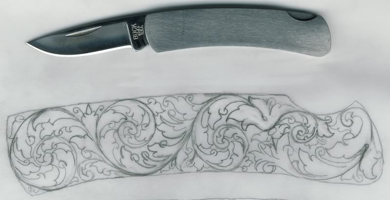
Thanks for the great advise:thumbs up: Here is my redraw, I guess i posted the first picture "upside-down", there will be a border, i haven't drawn that in. I enlarged the second scroll but it still looks a little smaller than the others, I think I might have to take out the 2leaf element to make it any bigger.I took the final curl in the initial scroll(now the last scroll) and made it a part of the 2leaf element, I'm kinda split over whether that made it better or worse.
That is a pretty good attempt and I would have to say well done. You have got the right ideas. I also like the way that you are trying to critique your own work........not an easy thing to do.
John has given you good advise and he is a masterful teacher.
The foundation of your work is the scroll backbone. If they are wrong.......then everything else is wrong. Your scroll backbones have kinks in them and are looking like they are forced into a space (like how many people can you fit into a telephone box)
So why don't we start at the beginning and walk our way through it step by step using the layout and design that you have come up with. On the way we will try and enhance it a bit and discuss problem areas.
So grab a new sheet of paper and lightly draw in all of the scroll backbones only.............get them exactley right and as best that you can......... and then post your results.
Then we can correct any problem areas an move onto the next phase.
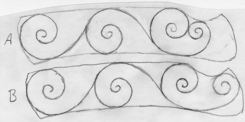
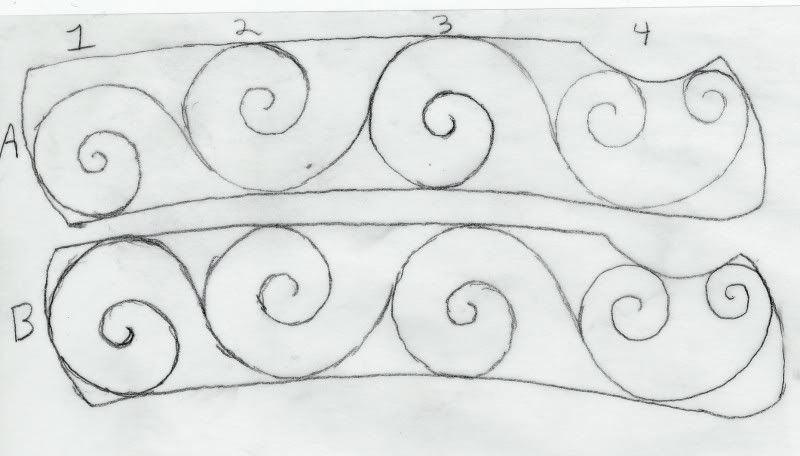
In (A) I shrunk scroll 4 to make it more symmetrical than in (B) but it leaves a gap above it. Should I shrink the size of scroll 4 so that 1,2 And 3 can be the same size? Since scroll 4 is the origin I would think it should have some weight and not be to small?
Now you are beginning to see your own problems which is great. This is what I would call the thumbnail stage, which means you are trying to see what exatley fits and what dosn't.....this is the most critical stage of the design as it dteremines good structure or bad.
B design is pretty obviously crammed and looking a bit sqaushed in there.
A design is better but dosn't quite look right with the smaller scroll not touching the borders. There are solutions to that one but it all starts getting a bit more complicated and I want to keep this really simple.
There is also another solution.........take #1 scroll out and keep the remaining 3 and balance/space them out better.
Hi Jason.
Sorry, I saw your design pointing in the wrong direction as I thought the finger cut was for a typical liner lock blade up near the hinge area.
You are on the right track with your design and Andrew is giving you good advice.
Working with bare backbones makes it easier to visualize a good design.
Taking out the last scroll and spacing things out will allow you to have a more graceful flow to your design.
Try to make the originating scroll as big as the scrolls that follow on from it.
Think of nature, the bottom or start of a plant is usually as big as or bigger than whatever follows it.
If you have to move the originating ball a little forward to do this so that the scroll can touch the margins ahead of the finger notch that's OK.
Some leaf detail can help fill in the area behind it later.
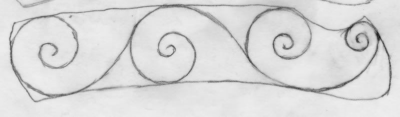
Here is my new scroll skeleton, I'm not sure if the origin is large enough but its quite a bit bigger than my original design. Taking that one scroll out did make everything seem more proportional.
That looks better and now you have given the design a bit of room to breath and not looked so crammed. Lets call these scrolls your primary scrolls and they will be the basis for what follows.
But
You still have a bit of tinkering to do on it before we carry on. John has told you about the "point of origin" (where the design starts) which in this case is the right hand scroll.
It is disproprtional to the rest. It starts with a large scroll and ends with a scroll of approximatley the same size.
Make the scroll on the far right a lot smaller and the one on the left a lot bigger and roughly the same size as the other two on the left. This may mean adjusting the other two scrolls as well. They don't have to be all the same size exactley and close enough is good enough.
What you are after is it to visually look proportional.
Just remember that this is probabley the hardest part of the whole design to get right.
Cheers
Andrew
I aslo put the proviso that what I am saying is my way of thinking only. This is the way I work things out and others will have a different process and way of thinking.
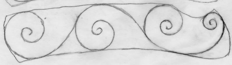
Is the scroll in (A) to far forward? will the design still look good with that much space filled with leaf elements? or is (B) more appropriate? Thank you Andrew and John for walking me through this and being patient, it can take me a few tries before i understand something.
Yes, A is too far forward and the area ro fill with leaf is a bit too much. There are ways around that but I just want to keep this simple and basic as it forms the basis of your future drawings.
So we will run with B..........however you need to make that far right hand scroll a little smaller as it's probabley still a little big. Think of it as a small bud with the plant growing from it.
Then we will move onto the problem areas this creates and how to deal with them by filling in with secondary scrolls.
No worries helping you out.............your the one doing all the work
Proportionatley that's about right. The curve that is coming out of it The very small right hand scroll)........bend it a little more and push it out slightly to the bottom right hand corner so it is a bit more curved.....at the moment it looks a little flat.
Drawing these things is about constant refining and even when filling in with leaves etc you still end up refining the scrolls a bit better so you are constantley going back and forth.
Does the outline around your scroll backbones represent the edge of the knife or your proposed border?
If it is the edge of the knife scale, the scrolls are way too close to the edge. If it is your proposed border within the scale then you should define it very precisely as this will impact your final design. While hand engraved ornamentation can be considered an art, it is one that requires precision in most of its elements.
Hang in there and keep working with us and you will make significant progress. And keep in mind that there are probably many out there who are following along with you in their own way but are not posting. Many of us are willing to spend the time on a theread like this because we know that we are reaching more people that the original poster.
:thumbs up:Way to go Jason! Watching you makes me want to take a crack at that slide again. I got some new books, but don't want to just copy someone else's ideas. Watching you work it out gives me a better idea how the process goes. Thanks for letting me watch and benefit from your efforts!
Roger, the outline represents a border within the knife. When i get my primary scrolls figured out i will retrace them into a more precise borderline, thanks for the tip.
Here is the slightly adjusted scroll.
Jason, well done.
You hung in there and now have a good basic design going.
Refine the backbone a little where scroll #1 and #2 meet. #1 is a bit flat below the intersection.
Make it meet like as in #2 and #3 and you're on the way.

")