Ancient Roman lettering.. Help!

Beladran

Elite Cafe Member
Joined
Jul 2, 2013
Messages
345
Location
mississippi
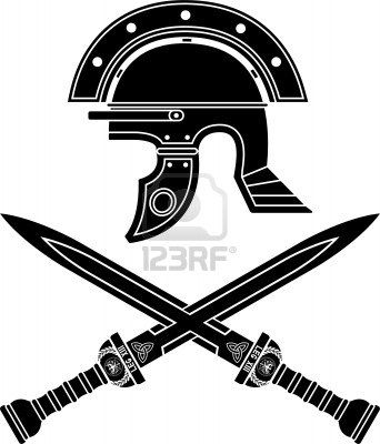
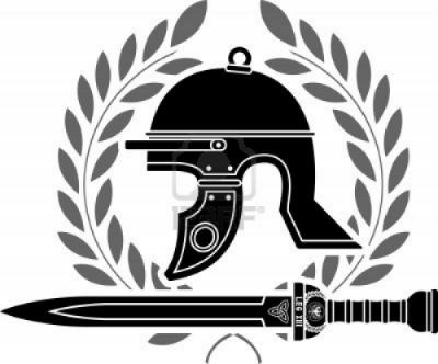
Ok friend of mine wants me to do a piece for him that I thought was going to be straight forward.. Just some lettering. Animus superbia et disciplina (courage pride an discipline) latin from high school an college was a little rusty but I got it conjured. Well he wants it in ancient roman script. An to top it off he now wants a helmet with crest on it with a galdius under it. I mean it's pretty straight forward cutting an shading but the wording is giving me fits! Google is not working worth a flip either. Can yal help me out ?
 

DakotaDocMartin

:::Pledge Member:::
::::Pledge Member::::
Joined
Oct 15, 2007
Messages
1,837
Location
Grand Forks, ND
ancient roman script

http://realhistoryww.com/world_history/ancient/Misc/Writing/The_first_ancient_writing.htm


Andrew Biggs

Moderator
Joined
Nov 10, 2006
Messages
5,034
Location
Christchurch, New Zealand
Don't you just love friends!! :)

The Times font is as close as you will get and it's readily available on all computers as part of the built in fonts. More modern variations can be found with things like Century etc etc.

Trajan Pro is probably closer to ancient Roman than Times. However it can be harder to make took correct depending on the layout. Most computers should have it or it's easily found in free font collections.

Engravers MT is also nice but it is an extended style so has limited use.

Cheers
Andrew
 

monk

Moderator
Staff member
::::Pledge Member::::
Joined
Feb 11, 2007
Messages
10,874
Location
washington, pa
sams' lettering dvd shows how he does the roman lettering. worth buying if time allows .
 

Red Green

Elite Cafe Member
Joined
Aug 19, 2011
Messages
391
Almost, your saying you have feelings about pride and discipline. You should try: " ferociae, superbia et disciplina", courage, pride and discipline.

Bob

Oh, by the way if it is pride of people or a group it should be 'superbio' the other way is used for the negative side of pride.
 
Last edited:

Beladran

Elite Cafe Member
Joined
Jul 2, 2013
Messages
345
Location
mississippi
Thanks for the heads up on that!

I started drawing the helmet today. I'm debating on the best way to cut the plum. Either heavy stipple an blacken it, do fine shading lines, or something similar to what i have drawn.


Thoughts ?
 

Marcus Hunt

~ Elite 1000 Member ~
Joined
Nov 9, 2006
Messages
1,799
Location
The Oxfordshire Cotswolds, England
Hmmmm, how accurate do you want to be with the helmet? Reasonably so I assume? I just googled "roman helmets" and grabbed these two designs quickly. You can see your helmet is a bit off; it's like a cross between a Roman and ancient Greek helm. It's not bad though and could easily be altered slightly.


As for lettering, roman is what we've always used in the English gun trade. It looks great when done well but poor lettering looks terrible and can really let things down. Unfortunately, everyone knows what letters look like so where as you might get away with dodgy scrollwork not so with letters. So practice 'til you're perfect before cutting on your actual watch.

Finally, where are you engraving this helmet and lettering, on the watch back? If so remove it before engraving if you use air assisted tools. Hand pushing is fine but the action and vibration of an air assisted tool could possibly either damage or destroy the watch movement.
 

Beladran

Elite Cafe Member
Joined
Jul 2, 2013
Messages
345
Location
mississippi
It's actually going to be on a belt buckle. I just had my watch up there for size reference.

He sent me two pics of what he thought the helmet should look like


I have a feeling these are the "Hollywood" versions of what a roman helmet should be. My first thought was the Spartans off 300 lol but I will ask him if he wants historically accurate or those.
 

Marcus Hunt

~ Elite 1000 Member ~
Joined
Nov 9, 2006
Messages
1,799
Location
The Oxfordshire Cotswolds, England
Of course the client/friend can have whatever they want. But it seems a bit odd to go through the specifying of "roman" font with a Latin text and a gladius (the Roman short sword) and then to stick a Greek helmet on it, that's all. Neither is there anything that says you shouldn't stylise it but those abominations that they wore in the movie Gladiator were ridiculous and looked daft in my opinion so I'd be tempted to steer clear of those. I'd always double check this kind of thing before you cut because someone is bound to point it out to him when he's wearing it and he might end up feeling a bit embarrassed if he's that kind of guy.
 

Beladran

Elite Cafe Member
Joined
Jul 2, 2013
Messages
345
Location
mississippi
What your saying makes plenty of sense to me Marcus. Looks like I'm going to stop drawing an go to the library. And do some research on this. I wonder if this is a motto of the roman legion?
 

Marrinan

~ Elite 1000 Member ~
Joined
Nov 11, 2006
Messages
2,917
Location
outside Albany in SW GA
How did they write Jesus or Julius? The J and the Z were added in 1262 or 1265 if I remember correctly. Can't recall when the G was added. Never could find out why they added the letters in the positions they did. Maybe they wrote the song when learned in the first grade before the settled on the order. Fred
 

Latest posts

Sponsors

Top