
AndrosCreations
Elite Cafe Member
- Joined
- Jul 14, 2010
- Messages
- 464
You've probably all heard of 'love tokens' but they're something new to me since I've only been engraving since August. I learned about them through my hobo nickel ventures.
I carve and sell quite a few nickels online now and I thought I'd try my hand at the love tokens too. There certainly isn't big money in it but you can still get paid 'something' to practice.
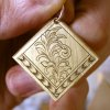
The first brass item may not technically be a love token by the strictest definition... but it was still good practice. There is a terribly obvious large leaf/tendril that is an eye sore. Live and learn... Both scrolls were cut without drawing them in or transferring (it's called improvisation in music [?])
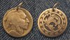
For the first time (besides one awful practice plate) I've engraved scroll and done background removal (picture #2) and even though the design isn't great, it was thrilling to be able to accomplish something with the help and information of all my engraving friends online. I welcome any critique.
I carve and sell quite a few nickels online now and I thought I'd try my hand at the love tokens too. There certainly isn't big money in it but you can still get paid 'something' to practice.
The first brass item may not technically be a love token by the strictest definition... but it was still good practice. There is a terribly obvious large leaf/tendril that is an eye sore. Live and learn... Both scrolls were cut without drawing them in or transferring (it's called improvisation in music [?])
For the first time (besides one awful practice plate) I've engraved scroll and done background removal (picture #2) and even though the design isn't great, it was thrilling to be able to accomplish something with the help and information of all my engraving friends online. I welcome any critique.
Attachments
-
 Love Token 4 e.jpg127.8 KB · Views: 176
 -
 Love Token 5 e.jpg155.1 KB · Views: 189


