Critique Request Practice piece.

D.M.

Member
Joined
Oct 12, 2007
Messages
88
Location
Austin, MN
Sorry for the poor picture quality. And sorry, I don't know how to put link to the big picture with a small preview in the post.:(

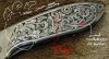
So-o-o... what we have here. The background is removed and stippled. The design is flat and shaded. I did not blacken or paint the cuts because I kinda like a bright cut effects. Originaly the plan was to blacken, but I'll leave it like that.
Ok, fire away.:cool:
Small picture, low resolution:


Link to the big picture:
http://artandknife.com/img/2010bf1.jpg
 
Last edited:

JBrandvik

Elite Cafe Member
Joined
Jan 6, 2007
Messages
268
Location
Bandera County, Texas
Very nice! I think you did a great job on a complex design. I don't usually like designs this leafy but you did a nice job of keeping the flow going. The design is a little heavy toward the blade with more background toward the butt, however, not distractingly so.

I do think you should reconsider blacking the background. I'll bet you would like it better. If not, acetone will remove ink or paint easily enough.

Hope to see more of your work.

Best,
 

Andrew Biggs

Moderator
Joined
Nov 10, 2006
Messages
5,034
Location
Christchurch, New Zealand
Hi DM

You have some nice ideas there and it seems to be well cut with quite a bit of thought and effort put into it. You have also put some thought into the shading as well. Overall it's a pleasing design that just needs refining.

I've attached some things for you to think about.

Mainly trying to fill big negative spaces with leaves and making scrolls touch borders. The other thing is your leaf shapes. Try and put some more pizzazz into them and give them more life. The red ringed area is where the leaves are a bit thick and it makes the design look bulky and you lose that secondary scroll line a bit.


But hey..........it's pretty good and with just some minor modifications and jazzed up a bit would look great.

Cheers
Andrew
 

Attachments

  • DM.jpg
    DM.jpg
    77.5 KB · Views: 127

pilkguns

~ Elite 1000 Member ~
Joined
Nov 14, 2006
Messages
1,874
Location
in the land of Scrolls,
Andrew, this is as fine a critique as I have ever seen. And you do so many of them, freely giving of your time. I think if anybody currently is deserving of the James B. Meek award from FEGA, it is you.
 

Sam

Chief Administrator & Benevolent Dictator
Staff member
Joined
Nov 6, 2006
Messages
10,491
Location
Covington, Louisiana
Good critique indeed and Andrew covered it nicely. This is a very pleasing design. I like the flow, especially where it starts at the front of the knife. Very pretty. :thumbs up:
 

D.M.

Member
Joined
Oct 12, 2007
Messages
88
Location
Austin, MN
Thanks for the critique and kind words.
I must ask something as I can feel and see my mistakes but do not know if I just lack experience or missing something simple and obvious.
When I draw the design on a paper It looks different than finished piece. That is understandable and described in Ron's books. I tried to compensate the leaves size and the black-white ratio in the drawing. IE I try to draw the leaves and the vine thicker than I'd like it to be on the piece. But when I do that I start to miss the leaf-to-border harmony.
Should I still try to draw the paper design with precorrections or there is some other way to see what the design is going to look in the metal?
I draw everything on a paper, than scan , mirror the image, print and transfer it. In some cases I trace it in the Power Point to make lines thiner.

How about drawing with the white marker or pencil on the black or very dark paper? Did anyone try that?
Thanks!
 
Last edited:

Andrew Biggs

Moderator
Joined
Nov 10, 2006
Messages
5,034
Location
Christchurch, New Zealand
Hi DM

That is very common and easily done.

There are a couple of things that usually happen. The first is the transfer in my experience is never 100% accurate so you end up having to scribe/burnish some areas and correct lines. This is normal.

When you draw a scroll for instance.........draw it so it just very, very slightly overlaps the borderline or completely touches it. So when you cut, it cuts into the border line.

The other is in the cutting of the lines.................cut on the outside of the transfer /scribed lines. If you cut down the middle it makes the design thinner.

Give it a try on a scrap piece of metal and you'll see what I'm talking about. It makes quite a bit of difference.

Cheers
Andrew
 

ddushane

~ Elite 1000 Member ~
Joined
Jan 7, 2007
Messages
1,016
Location
Andrews, TX
Very nice DM, I really like the layout. The sad part is, before Andrew showed the different aspects that could have been done a little different I thought it looked great, and it still does but what he said would be good. It makes me want to study mine a lot more. I never have but I need to have yall critique mine as well.

Dwayne
 

Latest posts

Sponsors

Top