Question: positive and negative space

Arnaud Van Tilburgh

~ Elite 1000 Member ~
Joined
Oct 3, 2008
Messages
4,221
Location
Belgium
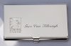
I bought me some very shiny business card boxes.
I've been practising on one to engrave this logo.
The box is the size of a business card of course.
The lettering of the name is no problem.
For the lettering beyond the logo "Lionhead Studios" I made a round engraver from a carbide bur.
The round engraver works great for block lettering.

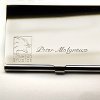
But the logo, I first tried a sort of bright cut, I mean that I rolled the 120° engraver in a way that the black spaces on the left of the logo are cut in one strike.

Second I tried to engrave thinner lines on both edges of the black space. Then I tried to shadow them that they become black.

I also tried to engrave lines on the edges of the black (negative) space while rolling the engraver to the outside to make a relief engraving byremoving the negative space by bur.
But that is to much work as I want to have a nice result without spending to much time.

I could engrave a square going so deep with the engraver that the thickness of the square line are like the line on the left. I then could also put shadowlines on the right black part with strait lines.
But making that part of the logo black is also very difficult to me because that means I have to make equal parallel lines.
So I think it is the fastest and best way to make the logo look like in my example, but how to cut the black lines that forms the lion head, in one cut with a outline, or engraving them with thin lines on the edge between black and white?

How should you masters engrave this one?

I have to engrave several, with other names of course.


arno
 

Attachments

  • _DSC6122 copy.jpg
    _DSC6122 copy.jpg
    121.2 KB · Views: 318
  • business kaartjes copy.jpg
    business kaartjes copy.jpg
    19.9 KB · Views: 237

Ron Smith

~ Elite 1000 Member ~
Joined
Apr 6, 2007
Messages
1,455
Arnaud,

You cannot expect to make the engraving look like pen and ink, therefore, I would texture this with a fine liner to simply make contrast against the lion's head. You might go in several directions with a wide fine liner. Or you could wriggle cut the backgroound all over to make the differing contrasting textures. It is next to impossible to get the same contrast as white and black with textures unless you fill it with ink or enamel it or something. You could do it with single point, but that would take forever as your lines have to overlapp in such a way that you would get a very fine, intense texture.

A matting punch would work also except that you would have to support the lid with thermolock or something similar and you stand the chance of denting it and deforming it.

Ron S
 

jetta77

Elite Cafe Member
Joined
Jul 19, 2008
Messages
621
Location
St. George Ut
I would stipple w a carbide point polished to a needle, and use your graversmith at 4200 strokes. You'll get pretty close to black.
Jeff
 

Peter E

~ Elite 1000 Member ~
Joined
Nov 9, 2006
Messages
1,795
Location
Canton CT
Arno,
I have experienced similar situations not knowing whether to make the object positive or negative or raised vs. lowered.

In the example of the lion head on the case, one thing I found that would make the lion head bolder, is to make one or two more cuts around the perimeter.

Peter
 

Marrinan

~ Elite 1000 Member ~
Joined
Nov 11, 2006
Messages
2,917
Location
outside Albany in SW GA
Arno, I think that the one you have cut is very nice -I can see nothing wrong with it what-so-ever-If you are looking for more dramatic contrast you might consider a sand blast or etch-not anything as in the etching real complicated but here in the states most arts and crafts stores handle etching compounds that would put a frost on the negative space and be pretty cost effective in that the resist is usally rubber cement and just a good rub will remove- Check out your local arts and crafts store and think a little out of the box on the treatment-Fred
 

monk

Moderator
Staff member
::::Pledge Member::::
Joined
Feb 11, 2007
Messages
10,868
Location
washington, pa
i would lay it on the line with the client and establish what sort of money they were wanting to spend for the job. that alone would determine how i would cut this. this could be done many ways in my shop. simple pantograph--cheep. laser, bit more pricey.
several ways by hand, all of which require differing time factors for me.
for me, the lower priced hand work would be bright cut script. the logo outlines would be bright cut with an oxidized, stippled background. no background removal at all.
btw: iv'e a long, long way to go before anyone ever calls me a master engraver !
 

Andrew Biggs

Moderator
Joined
Nov 10, 2006
Messages
5,034
Location
Christchurch, New Zealand
Hi Arnaud.

A master engraver I am not but here are my thoughts.

Very nice work and well done. The flare cuts look great. You have a few choices...........

1. Sandblast background.........not very durable and will wear off quickly
2. Bead blast background.........much more durable but will still wear eventually but not badly
3. Stipple background no releif.........not very durable and tops will rub off eventually and look terrible.
4. Releive background then stipple........will take a long time and has to be accurate and flat all over or won't look any good.Thinness of metal may be a problem as well. Time is the big factor.
5. Use horizontal lines close together.......time consuming and if not accurate will look terrible.
6. Leave as is..........looks great.

Cheers
Andrew
 

Arnaud Van Tilburgh

~ Elite 1000 Member ~
Joined
Oct 3, 2008
Messages
4,221
Location
Belgium
Thank you all for the clear comments.
Your comments confirm my struggles whit this design. But I think I now found a better to cut the LionHead thanks to you.
The metal is not that thin as you may think, so background removing could be a solution.
But I'm not gona do it that way, I will try a sort of bright cut with a outline on the bevelled side.
I then won't have to remove the background or stipple it.
The outer square will have a line that is wide enough.

I will show it once I'm ready with another try, there is still some space on the box to give it some try.

So thanks again for your clear suggestions how to do this one

arnaud
 

monk

Moderator
Staff member
::::Pledge Member::::
Joined
Feb 11, 2007
Messages
10,868
Location
washington, pa
arnaud: i just rememberd an incident from years ago; i've hand engraved a lot of these as well as pantographed them-- no problem. i did sandblast 2 of the same design ( simple background blasting ), for reasons unknown to me the lids both warped very badly from the blasting procedure. i might add that there was no excessive pressure or anything like that which might have caused the warping.
 

Marcus Hunt

~ Elite 1000 Member ~
Joined
Nov 9, 2006
Messages
1,799
Location
The Oxfordshire Cotswolds, England
Arnaud, I think you've made a fantastic job of this. Your script lettering is beautiful. Personally, I think you've got to the stage where it is best left alone; see what your client thinks of it.

If I were cutting the lines to the left and bottom of the square I'd use a narrow scorper (this is a flat made from a square/lozenge tool that gives the metal somewhere to go as it cuts; much cleaner cutting than a standard flat).

If the background must have something done to it for contrast, I'd support the lid and stipple the background. If the case is going to be carried, and I suspect it is, I don't think sand or bead blasting is going to be durable enough to resist scratches. As I said before though, I think it should be left as is.

Well done!
 

Arnaud Van Tilburgh

~ Elite 1000 Member ~
Joined
Oct 3, 2008
Messages
4,221
Location
Belgium
Marcus, thanks for your comments.

I did some more practising on this one, using liners and so on, but finally I have chosen for my first approach.
It isn't to much work and that way probably I can engrave more.
After all it is just a box, but I think this way it is something more precious if your business card ends in this box and you get one from it. :)

It is very shiny, so the photo was also hard to take

arnaud
 

Attachments

  • DSC_6207.jpg
    DSC_6207.jpg
    69 KB · Views: 48

diandwill

Elite Cafe Member
Joined
Aug 10, 2008
Messages
864
Location
Eastern, Washington State
Also nowhere near a master, and I think it looks great as is, but if you needed a background, a florentine finish is nice, it's hand cut and holds up pretty well. I've done a few as background on rings, and they were well received.
Will
 

Latest posts

Sponsors

Top