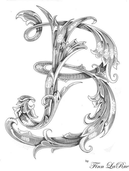
Nice B! If you want to remove some leaves what I see is to much wight on the right side of it. It looks like its leaning to the right. If I were doing it I would take three leaves of the inside of the B, 2 bottom 1 top. Flip them horizontal and use them to make loops on the left side of the body stroke.
The only other thing I can suggest is to weave the design together a bit more. By that I mean the front curved part of the B is behind the main stroke. If you weave it under, over, under, over etc it takes on a more integrated look.
my 2d try
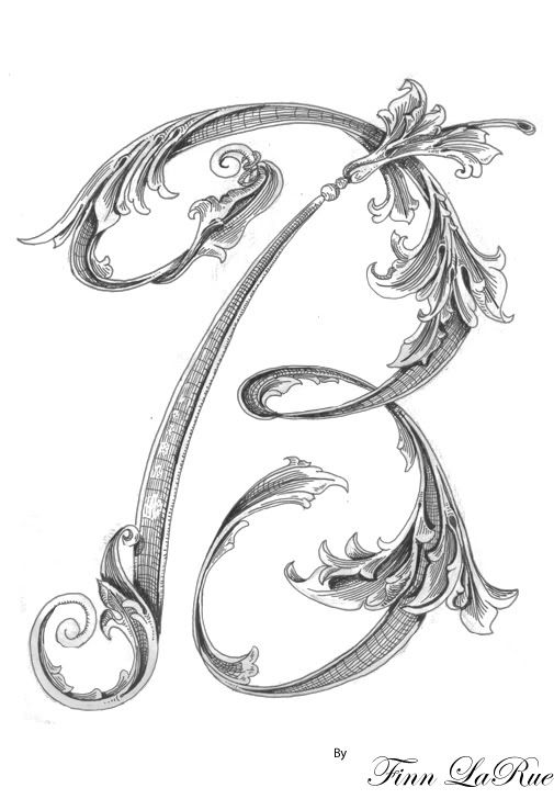
I drew it before i read all your coments. but i can try again if this one is still not as good.
but here it is any ways.
sam oh i see what you mean humm yeh that would be a big change..
Andrew i see what you are talking about, after i post it and look at it your way i can see i should have put some of the main stem beind the round B part
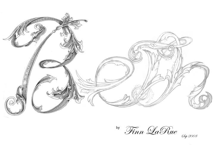
Can't wait to see your next one Finn. That's artistic talent buddy!! The more over-under, busy-leafy the better. I love an old fashioned monogram that is busy. From my study ... the vertical stem flow is generally done in same manner it is cut. As Sam suggests here ... flowing down.
If you do the entire alphabet, create a vector font ... you can cash in on this. High end fonts sell well and for very good money.
Here is the full name Beth.. i will fill the rest of it in with black pen in the next day or so. i normaly sleep on a drawing and look at it in a few days . gives me time to notice mistakes.
Wow Finn,
That's a lot of art and design work.
Just a personal comment about the design, if I may.
In your first post you asked for comment so here is mine.
I would rather see the B used like an illuminated first letter.
And the ETH in just a beautiful, flowing script.
Just my impression, the top of the T & H gets pretty busy.
And the whole thing will be hard to read as is.
Don't mean to offend, but my two cents.