finally finished

nicglass1

Member
Joined
Apr 7, 2007
Messages
66
Location
San Angelo, Tx
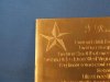
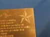
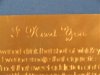
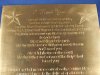
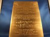
well everyone that brass plate that i have been working on is finally finished, and yes i made it in under the wire for mother's day. as everyone can see my lettering skills are pretty much non-existant, i am not happy with the way it looks in the end. my letters are not uniform, the cuts aren't as bright as i would like, the letter width is no where near being the same from letter to letter. what i do like is the finish that i was able to achieve from the various tips and help that i recieved from you great people. that cloth the tim sent me WORKS LIKE A CHARM. it gets a nice matte finish on the back ground and takes away most of the bright shine so that the letters still look good. this plate took me a good solid 2 and a half weeks of solid everyday work. i know that for most of you this is a 2 day tops job, but i'm not a professional and ended up having to go back and cut the ENTIRE plate again to make everything wider and deeper. what i did take away from doing this is ALOT of learning that i can apply to my next job. i gave this to my wife and she LOVED it, luckily she isn't looking too closely. and this plate will look alot better in a few months when oxygen does it's work and tarnishes the plate for me. i coated the plate and then sanded it back down so that my letters and stars won't tarnish but everything else will. so here it is, alot of hard work from a new guy. :)
 

Attachments

  • DSCF2287 (Large).jpg
    DSCF2287 (Large).jpg
    71.6 KB · Views: 234
  • DSCF2289 (Large).jpg
    DSCF2289 (Large).jpg
    58.1 KB · Views: 144

nicglass1

Member
Joined
Apr 7, 2007
Messages
66
Location
San Angelo, Tx
just more photos
 

Attachments

  • DSCF2290 (Large).jpg
    DSCF2290 (Large).jpg
    61.8 KB · Views: 76
  • DSCF2291 (Large).jpg
    DSCF2291 (Large).jpg
    54 KB · Views: 76
  • DSCF2294 (Large).jpg
    DSCF2294 (Large).jpg
    35.2 KB · Views: 106

KCSteve

~ Elite 1000 Member ~
Joined
Jun 19, 2007
Messages
2,882
Location
Kansas City, MO
Wow, impressive!

I'll bet your lettering skills are a lot better now then they were 3 weeks ago! ;)

From the pictures I'd say it looks pretty good. Yes, you can tell it was done by hand rather than the extreme regularity of a machine and that's probably a good thing in this application.

I need to do something like this so I can do decent lettering.
 

nicglass1

Member
Joined
Apr 7, 2007
Messages
66
Location
San Angelo, Tx
oh one more thing. the stars also have meaning to me and the wife, we have the matching nautical star tatoos on our arms. which is why they are going in different directions from each other, that is how we have them. and yes my lettering is MUCH better now then when i started
 

nicglass1

Member
Joined
Apr 7, 2007
Messages
66
Location
San Angelo, Tx
no. the first time i cut it i used a square, the 2nd time i made something the i hoped was around a 120 and laid it over. i thought about using a round, but i didn't see how i could make the cut wide enough for what i wanted. and then i ended up having heel issues which led to some really rough edges.
 

monk

Moderator
Staff member
::::Pledge Member::::
Joined
Feb 11, 2007
Messages
10,868
Location
washington, pa
i'll put money on it : anybody that casts a negative on that is a jerk !!!! that's going to be a treasure for a very long time !
 

Ron Smith

~ Elite 1000 Member ~
Joined
Apr 6, 2007
Messages
1,455
I am going to be a little "Jerky" here and give some tips on how to improve the preciseness of lettering.

For those who don't use a computer for layout.

1. Create height indicators on your letters. ( serifs or horizontal lines ) at the tops and bottoms of the letters (block style) until you have experience, before you use difficult styles (roman for instance).
2. Don't cut those horizontal lines on the line, but rather along the line. This gives you a better perspective and promotes accuracy.
3. Be critical of the spacing and don't use mechanical spacing. Use visual spacing.
4. An inscription: Start in the middle of the layout of your line, Start with a center letter and work toward the outside of the line of lettering.
5. Count your letters and spaces and divide, but count an "I" as a half letter and compensate for the diference widths of different letters such as the "W" or "M" which I count as a letter and a half, depending on the style I am using. This applies to monograms too. If you have three letters in a monogram, an "M" or an "I" doesn't fit to one side of the center as well as balanced letters, so don't try to do what is next to impossible. Choose a style that compliments the letters, ie, running monogram, drop monogram etc. But of course you have to plan that too in accordance with the space you are working in.

Hope this helps those that don't know these things yet.
Ron S
 

Latest posts

Sponsors

Top