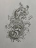
For some reason the shading of scrolls still eludes me. I feel like what I have here is technical correct, but it appears flat and dead in parts to my eye.
you have one highlight :color:, the shading is the same. the trick is to show more than one level. look at sam alfanos' work. his shading is great. shawn didyoung is also quite good at the technique. prepare yerself for a bit of practice
Thank you for the advice. I spent the night studying a bit more took some of your advice and gave shading this another try this morning. Its still not perfect but I think thats because I forgot the very first lesson, draw it bigger than you think you need.
drawing shade for me was always difficult. when i worked up a drawing, i never drew shade lines. i just cut them on the "fly". take a look at sams' video on shading. when cut properly, the lines are always more impressive in the metal, than on paper.
I always find I like the finished engraving better than the pencil drawing, especially shading lines so I don't draw them on paper anymore. I find that the smooth rotation of the ball vise makes it easier to make multiple parallel curved lines.
that's a bit better than the first. unless doing a workup for a client, a basic design is all you need. the actual shading is far finer than pencil work.