New belt buckle, critique request

dave gibson

Elite Cafe Member
Joined
Aug 18, 2009
Messages
323
Location
Livermore,CA
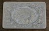
Here's one I fished up today, since the photo it's been domed and backing hardware attached. I'm pretty pleased with this one, I know the background isn't so great but I'm progressing.

I knew I'd be having some trouble laying down so many parallel lines so I thought I would intentionally try to keep it loose looking, I failed there, it's not at all what I envisioned. I tried putting some squared up pencil lines to follow, still got a lot of diagonals. I got the best results just keeping an eye on the edge and freehanding the cuts, quickly one after another very close, too close in many cases, it looks dark and obscures the scroll work in places.

I stippled the panel behind the head with a sharp round point and held it down to make some single point deep dots. They aren't so visible in normal light, the photo really makes them show so I added some more to even that effect out.

I'm playing around with removing backgrounds but 17 ga. nickel is the thickest nickel Rio sells, is that thick enough, I'm not real good at it yet and I have cut through in some past attempts.

Any opinions and advice on what could make belt buckles like this look better would be appreciated.
 

Attachments

  • bb: indian head.jpg
    bb: indian head.jpg
    111 KB · Views: 226

mdengraver

~ Elite 1000 Member ~
Joined
Apr 10, 2007
Messages
3,607
Location
Rockville, MD
Nice job! How about oxidizing some areas to make the other areas pop a little more! Darkening some areas to define some background negative space. Overall it's a nice design! You might want to also vary your line weights thick and thin for visual variety and interest, creating more of a feel of depth and 3 dimensionality! Tilt your graver in places to play off the light and create more of a bevel. Others on this site with more experience may want to chime and explain better how this is done!
 
Last edited:

John B.

Lifetime Pledge Member
::::Pledge Member::::
Joined
Nov 9, 2006
Messages
3,956
Location
Los Angeles area, California.
Hello Dave.
Lots of good work on your buckle and many ambitious ides.
If you want to relieve background 17 Gauge is thick enough if you use care.
It is about 1mm thick or almost .040 inches. BG only needs to be .010-.016 deep to be effective.
There are several ways to do this. An easy way is to cut parallel lines across the space using a square graver and then removing the space between the lines with a small flat graver or a narrow fine liner. Then either or both, texture with a cross hatched punch or stipple punch.
Lined backgrounds like yours are difficult and time consuming, but can be very effective if well done.
Many old time engravers could cut them just by eye almost in their sleep. But after many years of practice.
Again, there are several ways to learn to keep the lines straight and evenly spaced.
Lay the first line out using a straight edge and lightly scribe it. Cut it with a square or onglette graver.
Use a set of dividers in this cut line to lay out the next line, cut it and repeat, so on.
Another way is to layout, cut the first line and then use that line to guide a fairly wide spaced 2-line Liner tool.
I have several I have made from scratch or by modifying coarse factory liners by grinding off everything except two teeth.
Also E.C. Muller, NY made some wide spaced 2-line liners and I have some of these. You might check them out.
Hope this gives you some ideas and help. Keep going and posting your work.
 

monk

Moderator
Staff member
::::Pledge Member::::
Joined
Feb 11, 2007
Messages
10,870
Location
washington, pa
john b mentioned stippling. another alternative is wriggle cutting as a background treatment. such provides good contrast, and can also be used to lower the background a bit. flats, rounds and liners can all be used to achieve the effect. each will impart a different appearance. the 3 gravers, combined with variations of wrist movement, can create some interesting looks. for me, the best way was to do an accurate layout on the blank. wriggle to the lines. when done with that, do the actual engraving. this way the wriggling will never run into an engraved line.
 

dave gibson

Elite Cafe Member
Joined
Aug 18, 2009
Messages
323
Location
Livermore,CA
Thanks for your input, mdengraver, I won't be using chemicals to oxidize, I'm trying to create a product I can make in my small spare space with my small budget to sell to small budget customers and I'm losing money at it. I do darken sometimes with Rustoleum but the buyer specifically didn't want it here.
John B., I'd like to try a 2-line liner, I didn't know they exist. The method you describe reminds me of how checkering is done in woodworking, genius. I need to get / make some matting punches too, I've been attempting to level bkgds. with my airgraver, on high and a very dull square point.
monk,, I'd never considered wriggling in the background , I would have thought there isn't enough room here, wriggling with liners does have a cool look, never thought of using a round graver but i'm going to try it today. I attempted some wriggling last night and my gravers kept slipping, couldn't get a decent bite. I checked them with a loupe, all good,, maybe too much heel? I think I've heard of wriggling using flats w/o a heel? One that I was having the problem with had worked fine before, another problem to solve.
thanks again folks
 

John B.

Lifetime Pledge Member
::::Pledge Member::::
Joined
Nov 9, 2006
Messages
3,956
Location
Los Angeles area, California.
Yes Dave,
Two line liners work very much the same on lined backgrounds as two line checkering tools do on the checkering field.
Only let one line touch curved element or scroll lines and then finish the other line with a single point.
Walking or wriggling flats or rounds without a heel allows you to keep a lower hand and of course, liners don't have heels.
Monk told you the best way to do a wriggled or walked BG.
 

Latest posts

Sponsors

Top