Script

LVCIAN

Member
Joined
Sep 1, 2016
Messages
88
Location
St. Louis, MO
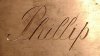
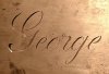
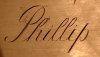
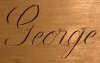
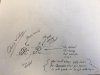
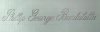
An early attempt at my name after a week or so of practice based on James Meek's and John Bowman's books.

There are some problems obvious to me after taking a step back from it. The first h is a little thin, the l's are not identical. The r's are different sizes. And the first a in the last name is a little fat.

On top of all that, my first name is all skinny letters and my seconding and third is mostly round shapes. So it's throwing my sense of balance off.

Any thoughts?
 

Attachments

  • IMG_20170830_210626116~2.jpg
    IMG_20170830_210626116~2.jpg
    34.9 KB · Views: 346

Sam

Chief Administrator & Benevolent Dictator
Staff member
Joined
Nov 6, 2006
Messages
10,491
Location
Covington, Louisiana
You have critiqued your design appropriately, and I will give you a standing ovation for your efforts. This is how you learn to draw script lettering, and you can rest assured it will look superior to the rubber stamp script lettering that people transfer from their computers. Your post made my morning. :clapping:

I would encourage you (and me, and everyone) to review calligrapher Dr. Joe Vitolo's thread on the engravers script alphabet which you'll find in the Tips Archive. He covers little things about each letter that I never knew existed.
 

LVCIAN

Member
Joined
Sep 1, 2016
Messages
88
Location
St. Louis, MO
Thank you Sam.
Your encouragement is going to help get me through addressing these issues.

I've found it very difficult trying to ignore the letters and just see the shapes but it's been very rewarding.
 

Southern Custom

~ Elite 1000 Member ~
Joined
Mar 8, 2013
Messages
1,026
Location
Baton Rouge
And this is why I come to the cafe to get work done, and facebook for fun. Most folks would never notice your criticisms. The changes you mention are what turns good lettering into fantastic lettering. I sometimes forget about Meeks book as a reference.
 

Tim Wells

~ Elite 1000 Member ~
Joined
Nov 9, 2006
Messages
1,331
Location
Dallas, Georgia
Something else that may be helpful is to watch some calligraphy on youtube. I like Calligraphy Masters Seb Lester and in particular Suzanne Cunningham. Watching these people use a nib and ink is as educational as it is therapeutic.
 

mdengraver

~ Elite 1000 Member ~
Joined
Apr 10, 2007
Messages
3,604
Location
Rockville, MD
I appreciate your self-critiques on your work but I'm personally impressed by your progress! Keep up the good work!
 

Tim Wells

~ Elite 1000 Member ~
Joined
Nov 9, 2006
Messages
1,331
Location
Dallas, Georgia
Another note: Avoid "front loading" capitals like P, B, R and the like. It is a natural tendency to do this but is incorrect. Instead backload the loop behind the upper part of the beauty cut or shade stroke if that makes any sense. Another thing to remember is to maintain a proper proportion or difference in the thick and thin lines. Strive to make the hairlines exactly that, hairlines as that contrast that is created by doing so is a large part of what makes this letter style so elegant.

As you start cutting it in metal, the smaller the letter sizes get, the harder it will be to maintain a proper hairline thickness in proportion to your shades and swells. At some point the hairlines become almost invisible if the letter is small enough. In fact it would be more critical in a smaller sized letter than in a larger one. When you practice in steel, copper or brass you'll see what I mean. I'd almost rather cut script than to cut scroll work, I'm weird like that...
 

mdengraver

~ Elite 1000 Member ~
Joined
Apr 10, 2007
Messages
3,604
Location
Rockville, MD
"Another note: Avoid "front loading" capitals like P, B, R and the like. It is a natural tendency to do this but is incorrect. Instead backload the loop behind the upper part of the beauty cut or shade stroke if that makes any sense" Tim could you show us an example of a right and a wrong way for this so I can better understand!
 

LVCIAN

Member
Joined
Sep 1, 2016
Messages
88
Location
St. Louis, MO
Another attempt, slightly different font than last time. This one flows a bit more logically, a little less flourish. Though I think I like it better.

I focused on my issues from the first attempt (above). I believe I managed to improve on all my previous gripes, though this time around I crowded the first "a" up against the capital "B" in my last name. I'll try to fix this during printing.

Are you all seeing anything I'm not?
 

Attachments

  • IMG_20170902_210923416~2.jpg
    IMG_20170902_210923416~2.jpg
    32.9 KB · Views: 181

mitch

~ Elite 1000 Member ~
Joined
Jul 23, 2007
Messages
2,636
i'm not anything resembling an expert in script, but at a glance it appears the "a"s in Bartolotta are a little fat, compared to the "p" & "g" and others.
 

LVCIAN

Member
Joined
Sep 1, 2016
Messages
88
Location
St. Louis, MO
And because learning from failure is never something to be ashamed of, here are my very first bright cut letters.

There are a couple things to be proud of here but controlling a flat is much different than controlling a V graver. I'm going to have to cut this a few dozen more times.

These are actually cut in series as drawn but to get good images I had to photograph them in parts.

Any advice?
 

Attachments

  • IMG_20170903_095540468~2.jpg
    IMG_20170903_095540468~2.jpg
    59.7 KB · Views: 86
  • IMG_20170903_095547878~2.jpg
    IMG_20170903_095547878~2.jpg
    85.2 KB · Views: 86
  • IMG_20170903_095613340~2.jpg
    IMG_20170903_095613340~2.jpg
    51 KB · Views: 86

JMiller

Elite Cafe Member
Joined
Oct 30, 2011
Messages
511
Location
Huntsville, AL
Looks good LVCIAN, as Tim said I have been watching those on youtube also among others... they are helpful and educational.
 

LVCIAN

Member
Joined
Sep 1, 2016
Messages
88
Location
St. Louis, MO
Ok. Last update on this practice. I promise.
This mornings efforts.

Time to move on to other efforts.

Generally happier with the over all forms and it was interesting to learn how the eventual cutting informs the design of this script.

Are my bright cuts wide enough? I feel like they should be... More. I guess.
 

Attachments

  • IMG_20170904_130645975~2.jpg
    IMG_20170904_130645975~2.jpg
    24.3 KB · Views: 58
  • IMG_20170904_130837497~2.jpg
    IMG_20170904_130837497~2.jpg
    54 KB · Views: 57
  • IMG_20170904_130848457~2.jpg
    IMG_20170904_130848457~2.jpg
    71.5 KB · Views: 57
  • IMG_20170904_130916332~2.jpg
    IMG_20170904_130916332~2.jpg
    60.6 KB · Views: 58
Last edited:

Tim Wells

~ Elite 1000 Member ~
Joined
Nov 9, 2006
Messages
1,331
Location
Dallas, Georgia
I'll draw something up and post it soon. I was painting all day long and didn't see this till bed time.
EDIT:
Here's a quick and dirty example of what I meant on the back of today's crossword puzzle. Obviously I need stronger reading glasses. Looks terrible enlarged like that but it illustrates the point.

Watch this video and it will illustrate far better than my crappy scribbling.

https://www.youtube.com/watch?v=dF3VjLGtCD8
 

Attachments

  • script.jpg
    script.jpg
    54 KB · Views: 27
Last edited:

Latest posts

Sponsors

Top