Sam again these kinds of illustrations are especially for learners like me who are visually orientated are most helpful. Thanks. Other parts of the engraver's world that is difficult to understand from written instructions is composition. It is one thing to compose for practice plate rectangles, ovals, rounds, squares and quite another with irregular angles and curves. A forum discussion with illustrations about composition would be of tremendous help for folks like myself.
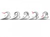
Thanks to Sam Alfano, beginners and intermediates can quickly improve their basic scroll design. One minor thing that I will point out for beginners is that when using some of the designs above, with a fully relieved background, the fine tips will disappear into the background if you don't plan for it. In fact, remember that all of the outline cuts become part of the background so you have to "bulk up" the foreground design a tiny bit to compensate for it. I have tried to illustrate this point with leaves 1 and 4 in the illustration with the black background. This issue is why, sometimes, beginner/untrained work looks like there is too much background and the scroll looks spindly.
to carry on Roger's point, note that removing/relieving background around leaves & scroll also loses much or all of the interesting changes in line width/weight on the outer cuts. when i have a few minutes i'll draw this out, but the concept is akin to comparing simple writing done with a ballpoint pen to fine calligraphy. somebody can probably explain or demonstrate this better than i am.
whenever a client insists on the full, solid background treatment right up to the borders i try to still include some areas where the edges of the pattern are left free/open for better expression of the quality of the engraved lines.