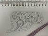
Just a quick sketch to practice different leaf elements and positive/negative space. I didn't shade the leaves. I am working on elements and balance here. Suggestions are welcome.
the detail at the point where the scrolls separate is a bit puzzling to me. granted it fills the intended space, but doesn't harmonize with the other details. also the 2nd detail, up from the base of the left scroll, a bit rough there. there's a couple others needing attention, but will save that for some other member. please to remember, those making statements such as i have, are interested in your improvement, and aren't intended to be demeaning in any way.
Just keep studying your favorite engravers work and reverse engineering the designs and think... I like the way that leaf goes... and the way they bring a scroll out of another like that... keep sketching. Nothing terribly wrong with that... just keep sketching.