Dani Girl
~ Elite 1000 Member ~
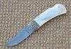
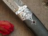
Folding knife with pearl handles made by Peter Bald.
Attachments
-
 1b5c6b9d-68ac-4cff-b622-e427342f5931.jpg119.4 KB · Views: 645

")


Three Notches of Arnie Saknussen
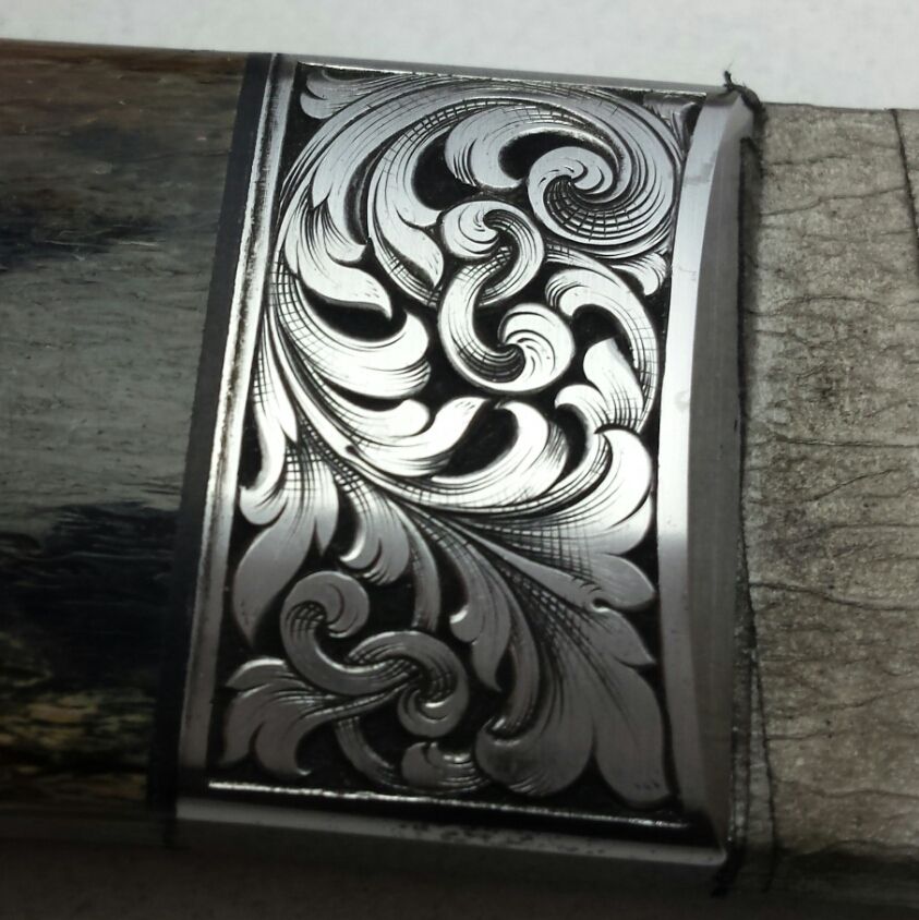
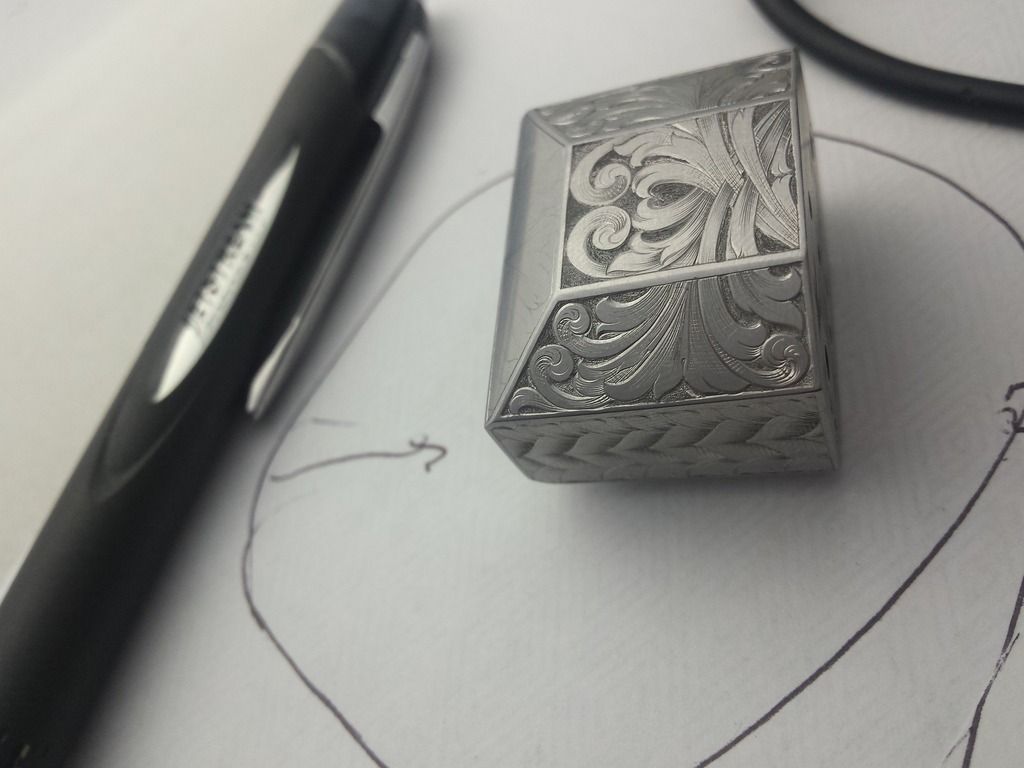
ok, Danae, you're getting there, but here's what I'm now seeing. you're cutting 'meaningless' extra shade lines near the centers of your scrolls. there are a few chicken scratches along the inner curve that don't really indicate any contour or shadow. they're the sort of unnecessary shade lines that get tossed in when an area seems too big & barren and just needs a bit more something. ALL shade lines should be used as if you are trying to depict a 3-dimensional object, NEVER just because an area looks too light. if your scrolls look like they have 'bald spots', they need redesigned for a more even tone, do not just use the engraver's version of a comb-over.
study these areas in some of Lynton McKenzie's work. he accomplished wonderful depth & form with an economy of lines. also try to work on cutting your shade lines thin to thick, or fine to fat, to achieve the proper gradient tones as they flow back into the leaves. you're doing that well in some places, but not everywhere.
ok, Danae, you're getting there, but here's what I'm now seeing. you're cutting 'meaningless' extra shade lines near the centers of your scrolls. there are a few chicken scratches along the inner curve that don't really indicate any contour or shadow. they're the sort of unnecessary shade lines that get tossed in when an area seems too big & barren and just needs a bit more something. ALL shade lines should be used as if you are trying to depict a 3-dimensional object, NEVER just because an area looks too light. if your scrolls look like they have 'bald spots', they need redesigned for a more even tone, do not just use the engraver's version of a comb-over.
Thanks mitch
study these areas in some of Lynton McKenzie's work. he accomplished wonderful depth & form with an economy of lines. also try to work on cutting your shade lines thin to thick, or fine to fat, to achieve the proper gradient tones as they flow back into the leaves. you're doing that well in some places, but not everywhere.