You are using an out of date browser. It may not display this or other websites correctly.
You should upgrade or use an alternative browser.
You should upgrade or use an alternative browser.
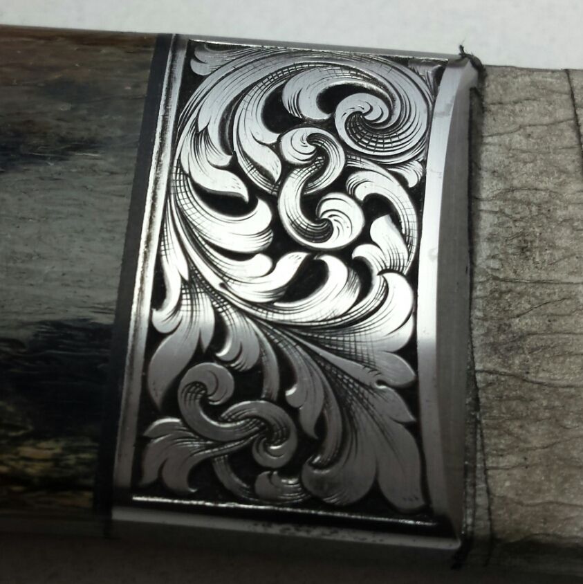
My latest piece. Peter Bald folding knife
- Thread starter Dani Girl
- Start date
wowilson
Elite Cafe Member
Looks just right.
Omar Haltam
Elite Cafe Member
very nice, good job
Dani Girl
~ Elite 1000 Member ~
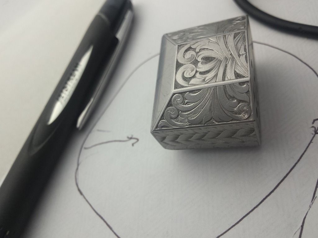
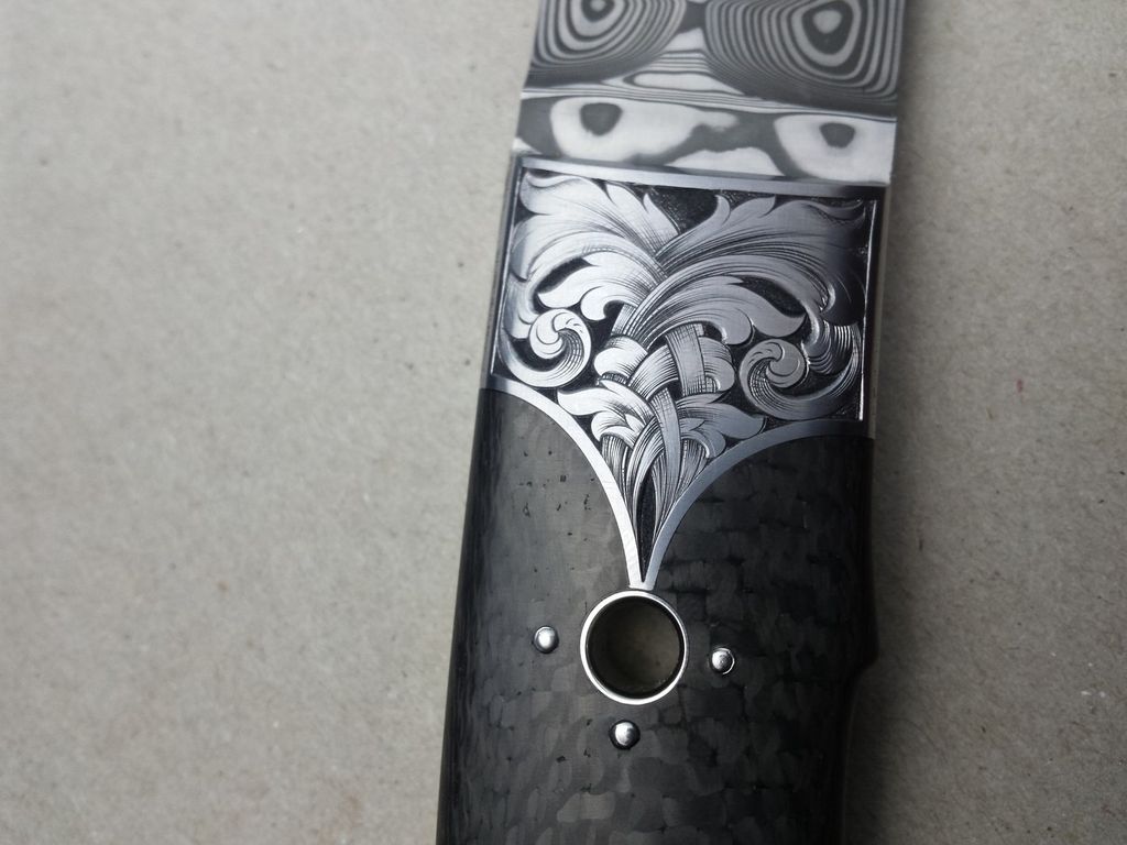
Some more photos of my work this month. These are Peter Del Raso's making. Damasteel Persian design, a giraffe bone chute knife (i think that's right) and a yet to be assembled one will be pictured, (he only sent me the guard). You should get better photos after they get back to the maker... he's a good photographer so I leave that to him.


Doc Mark
~ Elite 1000 Member ~
All of these a great Dani, but the design in the third photo is unique and has that "something special" that attracts patrons. Keep 'em coming!
Dani Girl
~ Elite 1000 Member ~
More pictures coming in the next couple of weeks when the maker gets everything finished and well photographed before the Melbourne knife show May 1.
I can't wait to see what it will be, it's a guard/like bolsters.
Thanks everyone. I'm always keen for reproof, imput, and critiques.
I can't wait to see what it will be, it's a guard/like bolsters.
Thanks everyone. I'm always keen for reproof, imput, and critiques.
Really love your work, Dani. And it's great seeing your progress. You're awfully good at this engraving stuff! :clapping: 

mitch
~ Elite 1000 Member ~
- Joined
- Jul 23, 2007
- Messages
- 2,636
ok, Danae, you're getting there, but here's what I'm now seeing. you're cutting 'meaningless' extra shade lines near the centers of your scrolls. there are a few chicken scratches along the inner curve that don't really indicate any contour or shadow. they're the sort of unnecessary shade lines that get tossed in when an area seems too big & barren and just needs a bit more something. ALL shade lines should be used as if you are trying to depict a 3-dimensional object, NEVER just because an area looks too light. if your scrolls look like they have 'bald spots', they need redesigned for a more even tone, do not just use the engraver's version of a comb-over.
study these areas in some of Lynton McKenzie's work. he accomplished wonderful depth & form with an economy of lines. also try to work on cutting your shade lines thin to thick, or fine to fat, to achieve the proper gradient tones as they flow back into the leaves. you're doing that well in some places, but not everywhere.

study these areas in some of Lynton McKenzie's work. he accomplished wonderful depth & form with an economy of lines. also try to work on cutting your shade lines thin to thick, or fine to fat, to achieve the proper gradient tones as they flow back into the leaves. you're doing that well in some places, but not everywhere.

Attachments
Dani Girl
~ Elite 1000 Member ~
Yeah, I thought the chicken scratches or the Three Notches of Arnie Saknussen I call them, from Journey to the centre of the earth.
They're probably a bit lame but I just thought they'll make my work easy to spot.
My brother hates my cross hatching, and I'm constantly struggling with scroll starts, especially shading them, and background
THANK YOU BENEVOLENT DICTATOR
They're probably a bit lame but I just thought they'll make my work easy to spot.
My brother hates my cross hatching, and I'm constantly struggling with scroll starts, especially shading them, and background
THANK YOU BENEVOLENT DICTATOR
Dani Girl
~ Elite 1000 Member ~
mitch
~ Elite 1000 Member ~
- Joined
- Jul 23, 2007
- Messages
- 2,636
Three Notches of Arnie Saknussen
wow, that took me back about 40+ years! i think i read that in junior high school.
Adder
Elite Cafe Member
Beautiful knife and great engraving
Keep posting!!
Jørn-Ove
Keep posting!!
Jørn-Ove
Dani Girl
~ Elite 1000 Member ~
ok, Danae, you're getting there, but here's what I'm now seeing. you're cutting 'meaningless' extra shade lines near the centers of your scrolls. there are a few chicken scratches along the inner curve that don't really indicate any contour or shadow. they're the sort of unnecessary shade lines that get tossed in when an area seems too big & barren and just needs a bit more something. ALL shade lines should be used as if you are trying to depict a 3-dimensional object, NEVER just because an area looks too light. if your scrolls look like they have 'bald spots', they need redesigned for a more even tone, do not just use the engraver's version of a comb-over.
study these areas in some of Lynton McKenzie's work. he accomplished wonderful depth & form with an economy of lines. also try to work on cutting your shade lines thin to thick, or fine to fat, to achieve the proper gradient tones as they flow back into the leaves. you're doing that well in some places, but not everywhere.

Sorry to be a pain but can I ask for more information. I am a little uncertain of exactly what you mean.
Dani Girl
~ Elite 1000 Member ~
ok, Danae, you're getting there, but here's what I'm now seeing. you're cutting 'meaningless' extra shade lines near the centers of your scrolls. there are a few chicken scratches along the inner curve that don't really indicate any contour or shadow. they're the sort of unnecessary shade lines that get tossed in when an area seems too big & barren and just needs a bit more something. ALL shade lines should be used as if you are trying to depict a 3-dimensional object, NEVER just because an area looks too light. if your scrolls look like they have 'bald spots', they need redesigned for a more even tone, do not just use the engraver's version of a comb-over.
Thanks mitch
study these areas in some of Lynton McKenzie's work. he accomplished wonderful depth & form with an economy of lines. also try to work on cutting your shade lines thin to thick, or fine to fat, to achieve the proper gradient tones as they flow back into the leaves. you're doing that well in some places, but not everywhere.

?meaningless extra shade lines.
?chicken scratches. Is that the reference to the three lines I throw in on scroll heads? Agreed I still don't start lines really fine... working on that.
mitch
~ Elite 1000 Member ~
- Joined
- Jul 23, 2007
- Messages
- 2,636
yes, Danae, i'm referring to the three little lines along the inner curve near the end of the three scrolls in the upper part of the pattern (doesn't appear you put them on the two lower scrolls). they don't indicate a contour or shadow, or add depth or interest. imho, they tend to distract the eye from an otherwise well cut design. kind of a- "Huh? What are those doing there?"
when i was starting out, i often experimented with little things like this, trying to create a distinctive, identifiable feature to call my own. over time i realized it was more than enough to just design & then engrave everything really well and my individual style would evolve naturally in the course of things. this will happen with your work, too (and you're advancing far faster than i did!). people won't look at your stuff and say, "That's Danae's engraving- you can tell by the three little chicken scratches." they will look at it and recognize the overall style- scroll size, form, layout, shading technique, the way you make certain details, etc. there will be no need for any contrived, superfluous touches.
when i was starting out, i often experimented with little things like this, trying to create a distinctive, identifiable feature to call my own. over time i realized it was more than enough to just design & then engrave everything really well and my individual style would evolve naturally in the course of things. this will happen with your work, too (and you're advancing far faster than i did!). people won't look at your stuff and say, "That's Danae's engraving- you can tell by the three little chicken scratches." they will look at it and recognize the overall style- scroll size, form, layout, shading technique, the way you make certain details, etc. there will be no need for any contrived, superfluous touches.
mitch
~ Elite 1000 Member ~
- Joined
- Jul 23, 2007
- Messages
- 2,636
next lesson. this shot is cropped from the center of the bolster. there are two nearly identical figures- one upper left, one lower right- that you've shaded the upper right portion of completely differently. the one on the upper left has 4 crisp, curved lines (could get thicker/darker at the edge), while the lower right has 6-7 straight fine, unevenly spaced scratches. like two different hands shaded each. the first is near perfect and the second is...not. consistency is important, especially consistently correct.
Attachments
Dani Girl
~ Elite 1000 Member ~
Ok. Thank you mitch. I am with you 100 percent and will try to take all that on board. You are right of course and it helps me learn to have a trained eye see things I miss.
Maybe that was cut with a badly sharpened chisel or some other unworthy excuse. Very uneven though. Hopefully it's too small to see with the naked eye.
Thank you for taking the time to answer my questions.
Thanks everyone. Will be keen to post more pictures over this coming week. Then that will be it for this thread
