You are using an out of date browser. It may not display this or other websites correctly.
You should upgrade or use an alternative browser.
You should upgrade or use an alternative browser.
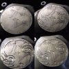
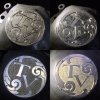
Other side of silver disc
- Thread starter NicGregson
- Start date
i think it's nice. i'm also a fan of negative space. what you show here has a bit too much open area. i like to balance the design and background so they are complementary. yours is a bit shy to my eye, but not bad
NicGregson
Member
Yes I agree. Letters should've been a bit bolder and larger. I think also should've gone deeper with the background due to the large areas to make it stand out more. Thanks monk 
atexascowboy2011
Elite Cafe Member
- Joined
- Feb 13, 2012
- Messages
- 997
Think about doing a border line around the letters to accentuate them giving an added dimension thereby visually increasing their size and at the same time diminishing the dead space.
the problem is-- there's so many options and techniques one can use on a given job. i'm not sure there is a right or wrong way these days. the recipient will surely like this. non engravers don't have the critical eye that we all have developed.Yes I agree. Letters should've been a bit bolder and larger. I think also should've gone deeper with the background due to the large areas to make it stand out more. Thanks monk
NicGregson
Member
Totally agree. This larger scale work is very new to me as I'm use to doing small scrolls and lettering on jewellery. This is a lot more interesting and fun! Thanks for your input, its greatly appreciated 
atexascowboy2011
Elite Cafe Member
- Joined
- Feb 13, 2012
- Messages
- 997
Hey Nic,
What are you using to cut this with ? Air or H&C ?
In pic #5 there are chisel marks indicative of hammer and chisel, while in the others it looks like air graver.
Thierry Duguet
Elite Cafe Member
- Joined
- Jun 4, 2007
- Messages
- 359
Actually I like the negative space, it is a way to focus the eye on the main "subject" of the engraving. I have more of a problem with the shading of the surrounding ornament and with the ornament itself. I think that the ornament should have been more delicate the counterbalance the strictness of the monogram, the shading should have been fuller (not heavier) to increase the three dimensional effect as the ornament stands above the background.
NicGregson
Member
I use a Palm control, no H&C. I think the picture looks like chisel marks is because there may have been some debris in the cuts that make them look like heavy progression marks.
Yes I agree, my shading needs a lot of work......on to more practice
Thanks for your feedback
Yes I agree, my shading needs a lot of work......on to more practice
Thanks for your feedback
Omar Haltam
Elite Cafe Member
Looks very nice , keep up the good workas they say practice makes perfect


