
You are using an out of date browser. It may not display this or other websites correctly.
You should upgrade or use an alternative browser.
You should upgrade or use an alternative browser.
Blaser R8
- Thread starter anmarinov
- Start date
Marrinan
~ Elite 1000 Member ~
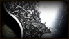
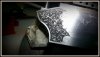
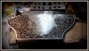
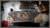
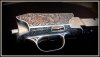
Ahtoh, I would like to be carful in how this is translated. Your background dot work is perfection. The design is unique and first class. It is very original and I have been trying to reach for a way to express color in black and white for a very long time. I think that when I talked about it on this forum people didn't get what I was trying to say. You have done that. It would be easy to say that it is a bit over-shaded but that is how you capture the various colors. It appears that you lack the contrast from smooth white or bare metal areas are lacking.. I feel that the change in direction and in the lines themselves have created various shads of green or yellow or whatever color I see carried right through the work.
Congratulations on achieving something all your own. There will be those who copy your style and mores the pity, it is yours and yours alone,, Fred
Congratulations on achieving something all your own. There will be those who copy your style and mores the pity, it is yours and yours alone,, Fred
Gemsetterchris
Elite Cafe Member
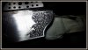
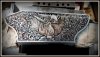
I very very rarely comment, but those pics really jumped at me & it looks fantastic ")
It's a really strong & bold looking engraving.
It's a really strong & bold looking engraving.
Indy Joneds
Elite Cafe Member
magnificent , you are very very skilful
Gemsetterchris
Elite Cafe Member
It would be easy to say that it is a bit over-shaded
That`s abit of an understatement
Way over shaded & far too heavy, but as it`s done well & intentionally it works in my eyes & is a unique style in it`s own right.
I think most engravings are too "samey" even though obviously the design is different.
Nothing much jumps out as anything new.
This looks like a seriously heavy banknote style.
mdengraver
~ Elite 1000 Member ~
Wonderful engraving, rich in it's intensity!!!!!!!!!!!!!!!
MexicanEngraver
Elite Cafe Member
nice work !!!!!
gcleaker
Elite Cafe Member
You can cut on one of my guns any time you want to
dlilazteca
~ Elite 1000 Member ~
Please do continue to show progression pictures
RDP
Elite Cafe Member
This is great work you are doing anmarinov, I like the rich dark colors you achieved here, and still shows tremendous detailed leaves and scrolls, I would say you have found your style, I would not change it if I were you, mtc,
Richard.
Richard.

tdelewis
Elite Cafe Member
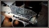
Good contrast between light and dark. It really makes it.
Marrinan
~ Elite 1000 Member ~
that Griz Looked like it was coming right out of the screen. Very life like and a master piece. Fred

Sponsors


