Critique Request critique please

jbrayout

Member
Joined
Jan 9, 2015
Messages
72
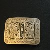
This is a buckle I made using adobe illustrator for all the straight lines. I did use a computer font for the lettering, next time I will use my own design. I would really appreciate your opinions on the engraving or any other helpful tips. Thanks.
 

Attachments

  • 074.jpg
    074.jpg
    153.7 KB · Views: 250

Dani Girl

~ Elite 1000 Member ~
Joined
May 6, 2012
Messages
1,110
Location
NSW, Australia.
Something Mr Biggs and Mr Alfano have encouraged me with is trying to get the scrollwork right up to the borders. You'll notice some of your scrollwork has got big background space between the border and the scrolls. Better to have them touching, even looking like they go slightly over/under the border is better than too much backround removed around your design, unless you mean to.

Study the fine line shading of great engravers and as you're cutting them in try to think about what effect with light and dark you are trying to achieve.

With practice you'll have to struggle less and less with the tools doing what you want them to and you'll concentrate more and more on what you're trying to achieve in the design.

You're doing great, that's a very nice belt buckle overall. Keep it up, keep at it.

(hope i come across encouraging)
Danae.
 

Sam

Chief Administrator & Benevolent Dictator
Staff member
Joined
Nov 6, 2006
Messages
10,491
Location
Covington, Louisiana
critique.jpg

I applaud your efforts. You've put a lot of time and energy into this buckle and it shows.

Please note the arrows on the left and the amount of white space indicated by the lower arrow vs the white space indicated by the upper arrow. This is a no-no. The upper part should never be narrower than the bottom like you have done.

On the right side note the arrow pointing to the way the side leaf grows from the scroll. It leaves the scroll in an awkward manner. It should sweep back and leave the scroll in an elegant, flowing way, like an exit off the interstate.

I hope this helps.
 

jbrayout

Member
Joined
Jan 9, 2015
Messages
72
Thank you so much for this information. I see what you are saying; I am very glad I posted this, very helpful.
 

jbrayout

Member
Joined
Jan 9, 2015
Messages
72
Hello Danae,. I have seen what you are talking about in Sam's videos. I will keep it up, I love this site, thanks for taking the time to help.
Jenny
 

Eric Olson

Elite Cafe Member
Joined
Nov 16, 2010
Messages
221
Location
Louisville, CO
I suggest more shading and/or smaller pattern on the centers of the flowers along the edge. Maybe even make them darker overall.
 

monk

Moderator
Staff member
::::Pledge Member::::
Joined
Feb 11, 2007
Messages
10,868
Location
washington, pa
one thing grabs my eye right away. the "weight" of the letters is too uneven for my eye. some computer fonts come this way. unless that is what the client specified, i'd strive for more balanced lettering. as far as it goes, this has an overall pleasant look to it. even tho the letters are computer generated, no rule says you can't make them a bit more pleasant to the eye using a pencil. thanks for showing, and do a couple hundred more !!
 

Latest posts

Sponsors

Top