
You are using an out of date browser. It may not display this or other websites correctly.
You should upgrade or use an alternative browser.
You should upgrade or use an alternative browser.
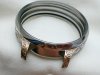
Question: Your opinion. Is it necessary to shade the pattern in the middle
- Thread starter zahar
- Start date
Jan Hendrik
Elite Cafe Member
From my personal standpoint as a novice engraver I would say yes. Shading the middle part of the design will bring everything together as a unit.
Gemsetterchris
Elite Cafe Member
Good question ")
I'm not sure I would on that particular design..matter of preference & wether you could figure a good way to go about it if you did ( which is probably why I'd leave it as is)
I'm not sure I would on that particular design..matter of preference & wether you could figure a good way to go about it if you did ( which is probably why I'd leave it as is)
To me the questions is how to shade it. That's not the normal leafy shape encountered in ornamental engraving so you'd have to experiment to see how it would look with different treatments.
Do I think it needs it? Not necessarily.
Do I think it needs it? Not necessarily.
mvangle
Elite Cafe Member
In my opinion or maybe more of a question: the unshaded design (I will call it focal point design) hits me first.
The shaded scroll work around it "frames?" it.
If you shade the "focal point design" it may "melt" into the shaded scrolls thus loosing the "focal point".:thinking:
The shaded scroll work around it "frames?" it.
If you shade the "focal point design" it may "melt" into the shaded scrolls thus loosing the "focal point".:thinking:
don hicks
Elite Cafe Member
Shading is supposed to enhance the contoured look and 3 dimensional look of an engraving,(foldovers and overlays). Without it, the center part looks flat and is flat, which looks great to me. Like Sam said , you would have to do some soul searching to figure out how to shade that design. Just my 2 cents. Nice job by the way.
Cheers
Don
Cheers
Don
John P. Anderson
Elite Cafe Member
I try to think of the audience which when viewing jewelry is usually several feet away or across the table. They're not zoomed in with a magnifier. I find that super fine detail can muddle the composition. That may not always apply but it's something I think about when coming up with a design.
I want the piece to intrigue them from a distance and also fascinate them when close up. It's hard to do both but I try.
I probably shouldn't be giving you advice as that's nicer than my stuff.
John
I want the piece to intrigue them from a distance and also fascinate them when close up. It's hard to do both but I try.
I probably shouldn't be giving you advice as that's nicer than my stuff.
John
Last edited:
Ed Westerly
~ Elite 1000 Member ~
My first impression was "that's not finished". I think the "spears" should have more definition, and the rest should be shaded as a ribbon. IMHO
Haraga.com
~ Elite 1000 Member ~
Nice case. Who made it?
Andrew Biggs
Moderator
Hi Zahar
Very nice work!!!
Is that a gold background? or is the watch brass?? Either way it's a nice effect.
Shading the pattern is a difficult one because in reality it is a lot smaller than the photo............Personally, I would put a very fine outline inside the geometric shapes so it gives them a small border. This would help define them a bit better It would be a subtle look but effective. If you are thinking that it needs something, then it does. If you are happy with the way it looks, then leave it. Either way it looks very nice indeed.
Cheers
Andrew
Dani Girl
~ Elite 1000 Member ~
My opinion isn't worth much but I like it the way it is but being an engraver it just feels unfinished. To a civilian it would look awesome I reckon. If I were to shade it at all it would be very lightly so it still very much stands out.
My .001c worth.
My .001c worth.
Marrinan
~ Elite 1000 Member ~
I think it is nice the way it is. If you tried to shade say where the ribbon crosses the spear or vise versa it would look to busy. same is true with the knob element. I quit like it the way it is. Fred
Ed Westerly
~ Elite 1000 Member ~
Well, at least now you know what to do! What with all of us agreeing that you should shade it, leave it alone, shade it lightly, etc.!!!
diandwill
Elite Cafe Member
You could sculpt it! Not the lines of shading, so would still be different, but would have the added definition.
Dani Girl
~ Elite 1000 Member ~
Can't wait to see the finished piece.
Sponsors


