First real project; Comments Welcome

Brant

Elite Cafe Member
Joined
Feb 6, 2014
Messages
198
Location
Weeki Wachee
I've only been trying to learn to engrave since April this year. I took Ray Cover's basic class in May and have been defacing practice plates ever since.

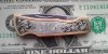
I just bought a Lindsay Classic and it has helped me progress. I picked up some of these knives to practice on and I am now asking to feedback and comments.

Don't hold back, let fly!! I'm a big boy and can take it.

Thanks in advance for all your help, I have learned tons reading here the last few months and this really is a great place for information.

Brant
 

Attachments

  • little knife to post.jpg
    little knife to post.jpg
    85.6 KB · Views: 296

Brian Marshall

~ Elite 1000 Member ~
Joined
Nov 9, 2006
Messages
3,112
Location
Stockton, California & Taxco, Guerrero, Mexico
Great job on the counterfeit dollar bill! Probly much easier to pass than those hundreds that everybody else copies?


There will always be some little stuff to take apart - the better you get the harder it may be to find it...

Left side - both upper and lower corners. Upper could have been filled more smoothly and flow better - unbalanced background.

Lower has that leaf pretty much coming outta nowhere and again unbalanced background.

Scrollwork is not quite like grass. Doesn't just sprout up like that.


I'll let someone else kick you about the right side...


Best feature is the lettering, though you might add a little extra curl to the top right side of the "K".


Keep at it. You've got a good start.


Brian
 

don hicks

Elite Cafe Member
Joined
Mar 16, 2011
Messages
554
Location
Pictou,Nova Scotia,Canada
I should be the last person critiquing anyones work, that is better than anything I have designed or cut. I like the border line, even depth and width except for lower left. I'm struggling with shading like most newbies, and I think yours follow the shape of the leaves pretty well on the left side, however I would run them further down the leaf on the left scroll third leaf to better define the backbone. On the right side third leaf the shade lines run to the outside of the backbone and should run alone the inside of the backbone, to define it. Lettering looks great and as Brian pointed out , a little something on the end of the K would better center it in the negative space.
These are some of my thoughts , everyone feel free to critique my critique if I'm way off. I still haven't got the nerve to post any of my scratchings. Maybe someday soon.
Cheers
Don
 

Mike Fennell

Elite Cafe Member
Joined
Apr 6, 2007
Messages
660
Location
Matteson, a south suburb of Chicago.
Hi, Brant,
It was great to see you in Omaha, and I look forward to seeing you in Las Vegas. I will hold you to your promise to help out there.

It is good to see what you have completed since the class. You are making great progress. Nice, clean cutting and excellent background stippling. Congratulations.

Your lettering is nicely cut -- better than expected so soon after a basic class. I would suggest that you keep the letters more equal in height except when making a monogram. The "J" seems to overpower the other letters. Also you could shorten the flourish on the beginning of the "R" so the spacing of the letters appears more equal. The "R" appears to be pushing itself too far away from the "J", in comparison with the spacing between the centers of the first two letters. Also, the upstroke of the "R" is slanted a little more to the right than the upstrokes on the first two letters. The letters will appear more cohesive if the upstrokes all have the same degree of slant.

Brian makes a good point about the origination of your scroll on the left. On your next knife, I suggest originate the left scroll at the lowest point of the lower left corner. Then the leaf at the bottom can be incorporated into the main scroll, filling the space without looking lonely. The tendril on the first leaf of the left scroll could be curved a bit more; it looks a bit stiff and straight.

The leaf growing out of the top of the backbone of the scroll should curve in a counter-clockwise direction, curving away from the scroll backbone toward the upper left corner to gracefully fill that area.

The scroll progression on the right side works very well. My only suggestion would be to experiment with slightly smaller leaves in the secondary scroll to get a little better balance between positive and negative space in that scroll -- a touch more negative space would lighten it up.

On the next knife you might try flipping that right-side scroll upside down so that the main scroll originates at the bottom right corner. Since the border is curving up and to the left there, it will be easier to get a smooth flow where the scroll departs from the border, and the scroll will feel more natural, growing up and out to the left off the trunk of the border. The scroll will then fill that space in a more relaxed and natural manner.

These are just my opinions. Others may have better advice. I hope some of it is helpful. I look forward to seeing you again. Bring your engravings to Vegas. After the seminars on Monday, you can obtain excellent critique and advice from other attendees.
 
Last edited:

Brant

Elite Cafe Member
Joined
Feb 6, 2014
Messages
198
Location
Weeki Wachee
Thanks for the critiques and comments. Just starting out it is a daunting task to get it all together. I really appreciate your taking the time to help me.

Also thanks for the "Likes“, a pat on the back helps with motivation.

Brant
 

Latest posts

Sponsors

Top