design critique

Dani Girl

~ Elite 1000 Member ~
Joined
May 6, 2012
Messages
1,110
Location
NSW, Australia.
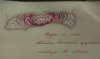
I have bought this ti and Damascus folder which I plan to engrave and hope to sell. Does anyone like this design, can you pick it apart for improvements, other ways to do it... Any and all input greatly appreciated.
 

Attachments

  • IMAG5105.jpg
    IMAG5105.jpg
    39.3 KB · Views: 259

Neo Dutch

Elite Cafe Member
Joined
Nov 9, 2006
Messages
186
I like how you've made the main scroll rise out of the border. I would rather see the left hand scrolls flow down instead of up.
 

don hicks

Elite Cafe Member
Joined
Mar 16, 2011
Messages
554
Location
Pictou,Nova Scotia,Canada
I have never seen a real dragon, but they tell me the ones we have in Nova Scotia have smaller front legs than back legs. To me it looks too horse like with the leg proportions as they are. Drop his back down and work in a serrated tail to eliminate any confusion about what it is. I really like your design concept though. Keep them coming and look forward to seeing it finished.
Cheers
Don
 
Last edited:

KCSteve

~ Elite 1000 Member ~
Joined
Jun 19, 2007
Messages
2,882
Location
Kansas City, MO
I can see the left hand scrolls coming down from the top to echo the way the wings come down. I also think the dragon is a bit 'horsy' in the initial sketch.
 

Thierry Duguet

Elite Cafe Member
Joined
Jun 4, 2007
Messages
359
I think that this drawing is not very useful. Should you want to draw what you will then engrave your drawing need to be more precise, if because of the scale a precise drawing is impossible just blow it up you can always reduce it later. If your drawing is just to give you an idea as to where you are going there is no point to do it on paper, draw directly on the object you are going to engrave.
In an other matter you should get a feeling about the lines of the object itself, contradicting those line is not always a good idea, the purpose of engraving is to enhance the support, to complement it, it is best done by emphasizing the existing curves, it will give more an impression of movement to the final result, you do not impose a preconceive idea to the object you adapt your idea to the object so the object and the engraving will complement each other.
 
Last edited:

Dani Girl

~ Elite 1000 Member ~
Joined
May 6, 2012
Messages
1,110
Location
NSW, Australia.
It's concept art, only needs to be good enough for experienced engravers to point out that the overall design is dumb in the first place. scrolls heading in the wrong direction, horse/dragons in the middle...

Maybe I should take the advice of just scrolling the hell out of it. I just kinda wanted to do something different because it's dark with the damascus blade, and i can colour the ti now... thought it would be fun. Just can't come up with a design. No rush though. ... maybe in ten years i'll come up with something good. :)
 

Silberschweif

Elite Cafe Member
Joined
Nov 13, 2013
Messages
183
Dani I like your work. I think the Dragoncave is a good idea but sometimes it´s better to see a little bit less than more. The Knife is a smal piece and I think it´s better to let look the dragon out of its cave. You can give the head more details. If you want to draw Dragons I have a book from Jessica Pfeffer thats very nice It´s a how to ...
here is the amazon link for the english version
http://www.amazon.de/DragonArt-Fant...80436&sr=1-3-catcorr&keywords=J+Peffer+dragon
 
Last edited:

Marrinan

~ Elite 1000 Member ~
Joined
Nov 11, 2006
Messages
2,917
Location
outside Albany in SW GA
Dan Girl, I like your concept. Always time for refinement after preliminary drawings. There are some excellent book including Drawing dinosaurs for dummies. My books a million has about twelve or more nice books. I would work the ends as well. Fred
 

Andrew Biggs

Moderator
Joined
Nov 10, 2006
Messages
5,034
Location
Christchurch, New Zealand
In an other matter you should get a feeling about the lines of the object itself, contradicting those line is not always a good idea, the purpose of engraving is to enhance the support, to complement it, it is best done by emphasizing the existing curves, it will give more an impression of movement to the final result, you do not impose a preconceive idea to the object you adapt your idea to the object so the object and the engraving will complement each other.

Very good advise from Thierry.....your idea doesn't fit with the contours or the shape of the knife.

Cheers
Andrew
 

Beathard

~ Elite 1000 Member ~
Joined
Jun 22, 2011
Messages
1,476
Location
Paige, TX
I too think it would look better as a bust instead of a full body. It would allow a lot more detail. Leave something to the imagination behind the scrolls and give a lot of detail in the head and upper wings. I personally like the scrolls going in a circular direction - one side up & the othe side down. Might want to give them a little more of a flame look since its a dragon theme.
 

Sponsors

Top