
Hi forum,
Here's my next engraving practice knife. As it is here right now harvesting season and we had rye field right next to our house it gave me some inspiration and the result is here (and cornflower is our national flower). Please tell me what and how can be improved.
One thing that I didn't know how to solve well was the direction of growth - on the left side of knife it grows from bottom and on the right side it's kind of opposite. I'm not sure what to think about it, is it OK or not?
One thing that I learned was that I should never test any new things out on a real piece - I tried different type of heel grind and I just couldn't control the graver, not sure what I did wrong, but it just didn't cut evenly.
I don't know what to do with lower center part where wheat border comes together, right now it's just empty. Any suggestions?
If I have my border changing size like it is on this knife, how should the wheat border behave? If the border is thinner should the 'boats' be shorter and if it grows wider on other places should boats also be longer? Right now it looks kind of random...
Viljo
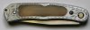
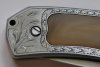
Attachments
-
 summerknife1.jpg103.1 KB · Views: 174
 -
 summerknife2.jpg95.6 KB · Views: 189


